Preview image. Unlock full-res
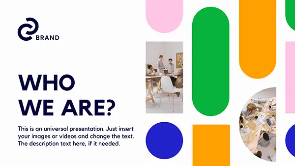
A 16:9 presentation slide pairing an oversized navy WHO WE ARE? headline on the left with a grid of rounded pills and circles in pink, green, orange and blue on the right, some containing team photos masked into the shape.
Summary
A 16:9 presentation slide pairing an oversized navy WHO WE ARE? headline on the left with a grid of rounded pills and circles in pink, green, orange and blue on the right, some containing team photos masked into the shape.
Visual description
Left column: a circular brand mark labeled BRAND sits above a heavy all-caps two-line headline (WHO WE ARE?) in navy sans-serif, followed by three lines of light gray placeholder body text. Right two-thirds: a near-edge-to-edge vertical grid of flat shapes—tall rounded-pill rectangles in pink, kelly green, amber orange and cobalt blue, interspersed with perfect circles. Two of the pill shapes contain photographs of people at office desks, cropped and masked perfectly into the rounded silhouette. Everything on clean white with generous margins and breathing room.
Key takeaway
Reuse one rounded-pill silhouette as both solid color block and photograph mask, unifying decoration and imagery in one shape language. The four-color grid feels energetic without overwhelming the oversized text anchor on the left.
Reuse notes
Works as an About or team-introduction slide for an agency or marketing deck where vibrancy and approachability matter. Photo crops must match the pill aspect ratio exactly for seamless masking. The four-color palette reads young and accessible; reduce saturation if the audience is more corporate-conservative.