Preview image. Unlock full-res
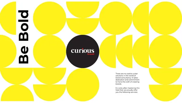
A bold brand identity grid system using bright yellow circles and semicircles in repeating rows on white, with a central black disk framing the wordmark 'curious brand' and a tall black logotype panel on the left.
Summary
A brand identity grid built from bright yellow circles and semicircles framing a central black logotype panel and a center black disc housing the brand name in white.
Visual description
A grid of bright yellow circles and semicircular shapes arranges across white space in a staggered two-column layout. A tall black vertical panel on the left contains the condensed sans-serif logotype "Be Bold" in white, anchoring the composition. At the center, a large black disc frames the wordmark "curious brand" (lowercase, italicized serif) with a small orange accent mark on the secondary line. The yellow shapes have hard edges and sit flush to the white, creating clean geometric rhythm. Circles overlap the boundaries between rows, creating visual continuity and dynamic spacing.
Key takeaway
The grid system of pure geometric shapes that can be extended or adapted for pattern variations and applications. The central black disc as a focal point and secondary logo treatment. The confident use of two typefaces (sans-serif logotype plus serif wordmark accent) without visual conflict.
Reuse notes
Ideal for creative services, consulting, or tech brands needing a system that scales from signage to digital. The circle grid adapts well to business card, envelope, and packaging backgrounds. Best when brand positioning is modern, ambitious, and young-leaning.