Preview image. Unlock full-res
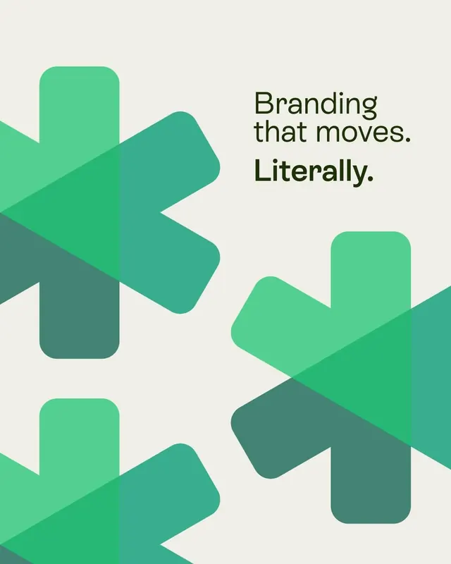
A vertical social tile where overlapping rounded-arm asterisks in two shades of green create motion blur on a cream ground, paired with the tagline Branding that moves. Literally.
Summary
A tall layout where stacked rounded-arm asterisks in soft mint and darker teal green overlap and blend, with the setup line "Branding that moves." and the punchline "Literally." in black sans-serif.
Visual description
Cream ground filled with five oversized six-armed asterisks rendered with softly rounded terminals. In the upper left quadrant, two mint-green marks overlap slightly with a multiply-blend effect, creating a darker teal intersection that reads as motion blur or a frame captured mid-animation. Two more asterisks in matching mint and teal sit in the lower right and upper right corners, also slightly overlapped. Against this composition, black sans-serif text occupies the right half: the setup "Branding that moves." in regular weight across two lines, followed by the payoff "Literally." in a bolder weight. The shapes bleed off the left and bottom edges, and the color palette remains subtle and earthy with the cream background, mint primary, and darker teal secondary.
Key takeaway
Convey movement through a flat graphic by duplicating one mark, offsetting it, and letting a multiply blend darken the intersection, making a single shape function as its own motion trail. Structuring a tagline as a setup line plus a bolded payoff word gives small-format layouts comic timing and narrative arc.
Reuse notes
Well-suited for agency or studio social tiles, about pages, or footer branding where the visual identity promises motion, growth, or energy. The overlap technique scales naturally into actual animation loops. Keep the two greens close in hue so the multiply blend reads elegant and integrated rather than muddy; highly saturated greens can make overlaps appear dull or dead.