Preview image. Unlock full-res
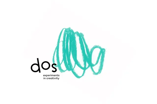
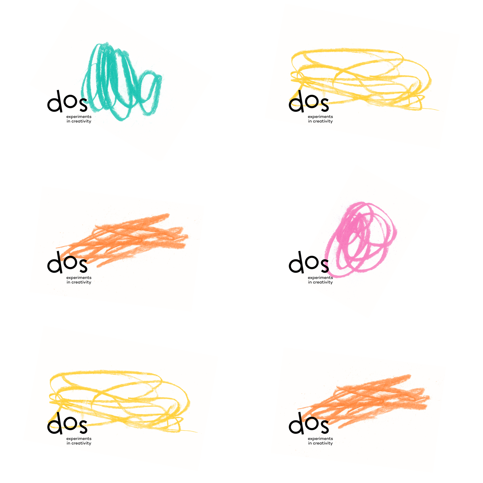
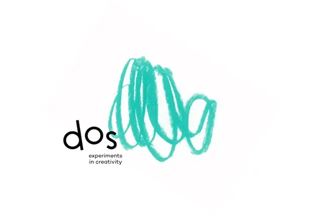
A studio logo pairing a lowercase black wordmark, dos, with a loose teal pencil scribble that fills the space where the final letter would sit.
Summary
A clean studio logo where a lowercase black sans-serif wordmark, dos, butts directly against a loose teal pencil scribble. The scribble reads as a continuation of the word, standing in for the letter shapes that would follow.
Visual description
Set on plain white, the logotype sits at lower-left in a rounded geometric sans-serif. The letters d, o, s in black flow straight into a dense, energetic scribble in bright teal, drawn with a textured pencil or crayon stroke that shows individual hairline marks rather than a clean vector. The scribble loops and overlaps to roughly the height and width of two extra letters, balancing the small wordmark with a large expressive mass. Beneath the wordmark, two short lines of fine print read as a tagline (experiments in creativity). Generous white space surrounds the whole mark.
Key takeaway
Letting a raw, textured hand scribble finish a typeset word, so the brand mark is half precise type and half gesture. The visible pencil grain keeps it human and impossible to copy exactly. Matching the scribble mass to the optical weight of the missing letters keeps the lockup balanced without a containing shape.
Reuse notes
Good for a creative studio, illustrator, kids or craft brand, or any identity that wants to signal playfulness and process over polish. The hand-drawn element doubles as a flexible brand asset (it can grow, animate, or recolor). Caveat: the scribble must be redrawn rather than scaled to stay convincing, and it can read as messy in very corporate contexts.