Preview image. Unlock full-res
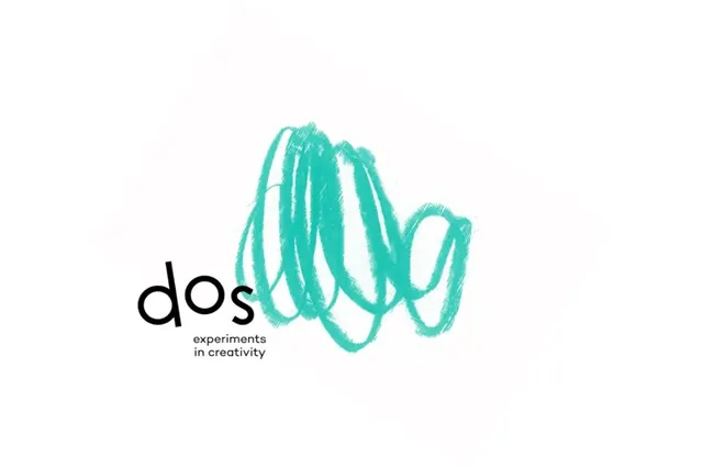
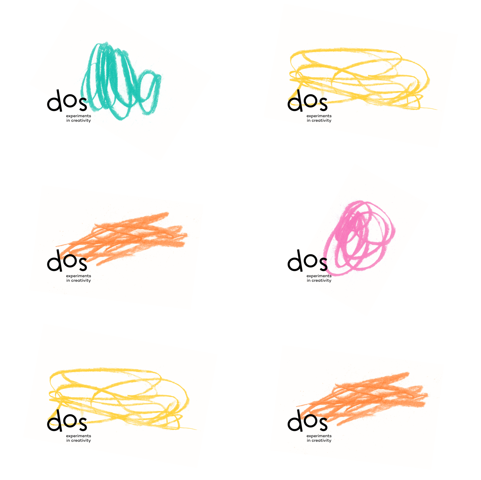
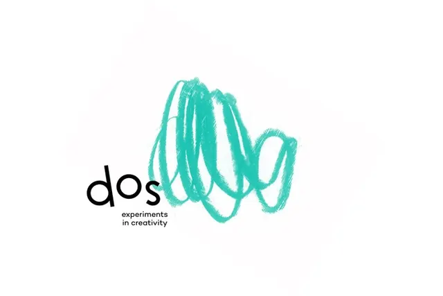
A lowercase black 'dos' wordmark sits beside a loose teal pencil-scribble mark, captioned 'experiments in creativity' on a white field.
Summary
A logo lockup for "dos", a creative studio, that contrasts a tidy lowercase black wordmark against a loose, scribbled teal mark resembling fast pencil loops, on a clean white background.
Visual description
The composition is mostly empty white space with the logo grouped toward the lower-left. "dos" is set in a rounded geometric lowercase sans-serif, solid black, and directly under it sits a small two-line tagline, "experiments in creativity", in a much lighter weight. To the right, filling the upper space, is a vibrant teal gesture: dense overlapping scribble loops with visible pencil-stroke texture, reading as energetic mark-making rather than a clean vector. The teal is the only color; everything else is black on white. The hand-drawn mark and the controlled type create a deliberate tension between order and play.
Key takeaway
The pairing of a disciplined, neutral wordmark with a single expressive hand-scribbled brand mark, where the rough gesture supplies all the personality so the type can stay quiet. The texture of a real pencil stroke (rather than a smooth vector squiggle) is what sells it as "experiments".
Reuse notes
Great for a creative agency, studio, or experimental side-project that wants to feel approachable and human. Works as a flexible system: the scribble can change shape per use while the wordmark stays fixed. Caveat: a gestural mark like this can read as messy at small sizes, so it needs the surrounding white space to breathe.