Preview image. Unlock full-res
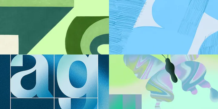
A 2x2 grid of abstract painterly panels splitting greens from blues, mixing hard geometric shapes, brushy texture, condensed type, and a liquid-marbled butterfly.
Summary
A four-panel art-direction board arranged as a 2x2 grid, with the left column in greens and the right in blues, each cell exploring a different surface: flat geometry, brushy painted texture, gradient serif letterforms, and a marbled liquid butterfly.
Visual description
The image is split into four roughly equal quadrants. Top-left is flat geometric color-blocking in mint and forest green, including a quarter-circle and a small cream rectangle, with a faint canvas texture. Top-right is a loose painterly field of sky blue with vertical comb-like brushstrokes and bleeding edges. Bottom-left is a dark navy panel holding two large lowercase serif letters, a and g, filled with a grainy metallic blue-to-white gradient and boxed in thin rules. Bottom-right shows an iridescent, marbled liquid form resembling a butterfly in shifting blue, green, and violet over a pale mint ground. The four treatments share a tight green-blue family but deliberately contrast hard versus soft, flat versus gradient.
Key takeaway
Building a single board out of four opposing texture studies, flat geometry, raw brushwork, gradient type, and liquid marbling, is a fast way to define a brand's tonal range in one frame. The strict green-left, blue-right color split keeps the variety from reading as chaos.
Reuse notes
Useful as a moodboard or style-exploration tile early in an identity project, or as a system page showing approved texture treatments. Each quadrant could seed its own application, so it works well as a menu of directions to narrow down with a client. Not a finished asset on its own.
More like this


Keep what you find
A free account saves references to boards and can send you a weekly email of picks based on what you save.
To see every result, go Pro.