Preview image. Unlock full-res
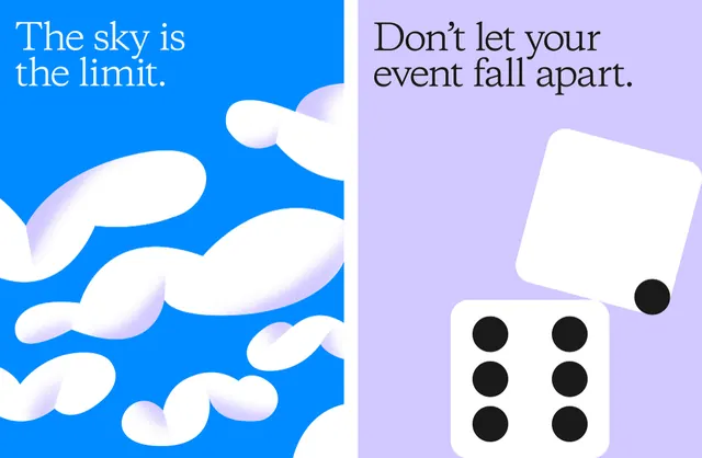
Two side-by-side brand posters, one a cobalt-blue cloud field, one a lavender panel with a tumbling white die, each topped by a large serif headline.
Summary
Two brand posters shown together: a bright cobalt-blue panel filled with soft white cloud blobs reading "The sky is the limit.", and a lavender panel reading "Don't let your event fall apart." with a white six-pip die tumbling apart mid-frame. The defining move is pairing a large refined serif voice with flat, playful abstract shape illustration.
Visual description
Each poster is a flat color field with a left-set headline in a high-contrast transition serif (thick-thin strokes, true italic comma and apostrophe). Left panel: saturated blue background with white gradient cloud forms that read as smoke or bubbles, headline in white. Right panel: pale lavender background, headline in near-black, with two rounded-corner white squares, one face showing six black pips like a die, the other blank and rotated, a single black dot floating off its corner so the cube appears to be coming apart. No logo, photography, or UI; the whole identity is carried by type plus geometric props.
Key takeaway
The system: one editorial serif headline, one flat background color, one simple symbolic prop per layout. Swapping only the color and the central shape keeps a campaign coherent across many executions. The die literally illustrating "fall apart" shows copy and image doing the same job at once.
Reuse notes
Good template for an event, conference, or marketing campaign that needs many on-message variants fast. The serif keeps it from feeling like generic startup work; pair with one accent color per message. Caveat: the visual gag relies on the headline, so the prop must be chosen per line of copy.
More like this

Keep what you find
A free account saves references to boards and can send you a weekly email of picks based on what you save.
To see every result, go Pro.