Preview image. Unlock full-res
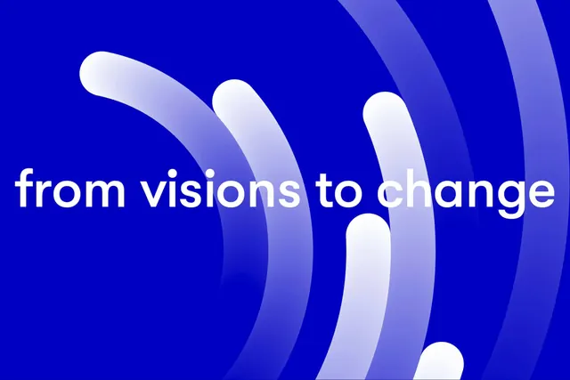
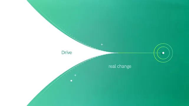
A logo system for a change-focused brand using flowing curved shapes that transition from white to bright lime green, anchored by a concentric-circle mark.
Summary
A logo and wordmark pairing for a change-focused brand that uses sweeping organic curves and a teal-to-lime gradient to convey forward momentum.
Visual description
A sans-serif wordmark "Drive" sits left of center in teal, with "real change" aligned to its right in the same typeface. A concentric-circle mark with a bright lime border floats on the far right. Behind the composition, two large organic curved shapes flow diagonally across a deep teal background, the upper shape white and the lower shape in medium teal, creating a sense of movement. Small accent dots punctuate the composition. The overall effect is modern and tech-forward without being heavy.
Key takeaway
The flowing, curved background shapes that suggest motion without competing with the wordmark. The use of a single accent color (bright lime) for emphasis on the mark. The restraint in typography and icon simplicity, letting the gradient background do the visual lift.
Reuse notes
Effective for mission-driven tech, nonprofits, or consumer apps that need to convey momentum and optimism. The curved shapes work best when the background has breathing room; pair with plenty of whitespace and avoid dense layouts that would crowd the forms.