Preview image. Unlock full-res
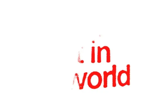
Rough, spray-textured red lettering spelling fragments of 'in' and 'world' sits low-right on an otherwise blank white field, as if caught mid-reveal.
Summary
A near-empty white frame carrying only rough, spray-textured red lowercase lettering at the lower-right, where the fragments "in" and "world" are legible and the rest of the phrase is cut off.
Visual description
Roughly the left two-thirds of the frame is blank white. In the lower-right quadrant, red lettering with a heavy spray or ink-bleed texture spells "in" on one line and "world" below it, the strokes ragged and stippled rather than solid. Faint red speckles drift up and to the left, suggesting the word began off-frame or was animating into place. The extreme red-on-white contrast and the off-center, partial placement make the type feel caught mid-motion rather than finished.
Key takeaway
The grainy, sprayed red texture turns plain lowercase letters into something raw and urgent without any custom drawing. Pushing the type hard into one corner against a vast white void is a confident way to make a small amount of text feel loud and intentional.
Reuse notes
Useful as a texture or treatment reference for protest-poster, zine, or streetwear typography where roughness is the point. Because this capture is partial, treat it as a texture cue rather than a finished layout. The sprayed-red-on-white look pairs well with stark, content-light compositions.
More like this



Keep what you find
A free account saves references to boards and can send you a weekly email of picks based on what you save.
To see every result, go Pro.