Preview image. Unlock full-res
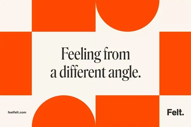
A Felt brand poster built from an orange-and-cream Bauhaus checkerboard of squares and half-circles, framing a centered serif headline reading 'Feeling from a different angle.
Summary
A landscape brand poster for Felt that frames a centered serif headline inside a Bauhaus-style checkerboard of bright orange squares and half-circles on cream. The contrast of a refined serif against blocky geometric shapes is the whole idea.
Visual description
The frame is divided into a loose grid of large orange squares and orange half-circle forms set against a warm cream ground, leaving a cream cross of negative space through the center. In that open middle sits "Feeling from a different angle." in a high-contrast serif with elegant thin-to-thick strokes, in near-black, set across two lines. Lower left carries "feelfelt.com" in a small bold sans; lower right the "Felt." wordmark in bold sans with a period. Only two colors do all the work: a single saturated orange and cream, with the dark type for contrast.
Key takeaway
The tension between a playful geometric frame (squares plus half-circles in one flat orange) and a serious editorial serif headline floating in the negative-space cross. Building the whole composition from two shapes and two colors keeps it instantly legible at any scale.
Reuse notes
Reach for this as a social or out-of-home brand card when you want a confident, design-forward statement without imagery. Works for agencies, design tools, and lifestyle brands. The single-orange palette is striking but loud; soften with the cream and let the negative-space frame do the breathing.
More like this


Keep what you find
A free account saves references to boards and can send you a weekly email of picks based on what you save.
To see every result, go Pro.