Preview image. Unlock full-res
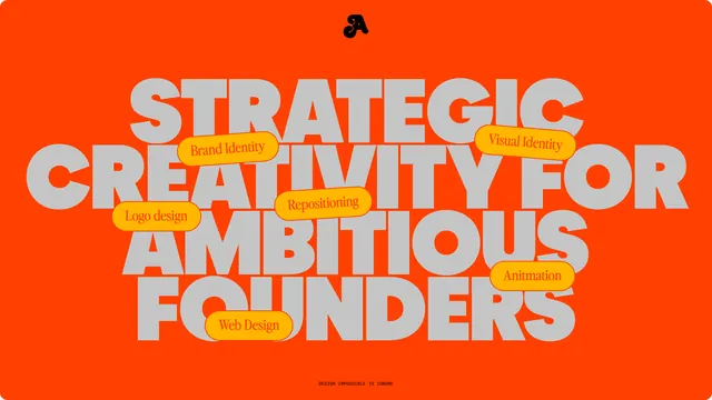
A creative-services branding identity with bold stacked sans-serif type on vibrant orange, accented by yellow service labels.

Summary
A creative-services branding identity with bold stacked sans-serif type on vibrant orange, accented by yellow service labels.
Visual description
A vibrant orange background fills the canvas. Stacked sans-serif letterforms dominate in a warm gray, reading "STRATEGIC CREATIVITY FOR AMBITIOUS FOUNDERS" (across multiple lines). Six yellow rounded-rectangle labels overlay or nestle within the type, each containing a single service: "Brand Identity," "Visual Identity," "Logo design," "Repositioning," "Animation," "Web Design." At the bottom, a small all-caps line reads "DESIGN IMPOSSIBLE TO IGNORE." The composition is vertically centered and rhythmic, with the label callouts creating a secondary layer of visual hierarchy.
Key takeaway
The label-as-callout technique: overlaying or embedding service tags directly onto display type breaks the static quality of large typography and makes it scannable. The warm/cool contrast (orange vs. gray type vs. yellow labels) unifies the whole without feeling cluttered. The layering creates depth even in a flat style.
Reuse notes
Works for any design, marketing, or creative firm needing bold personality and service clarity in one gesture. Requires display-weight sans-serif that can hold its own against overlays. Keep the number of labels tight (5-7) to avoid visual chaos. Orange pairs well with this type treatment; other warm primaries may work but shift the mood.
More like this



Keep what you find
A free account saves references to boards and can send you a weekly email of picks based on what you save.
To see every result, go Pro.