Preview image. Unlock full-res
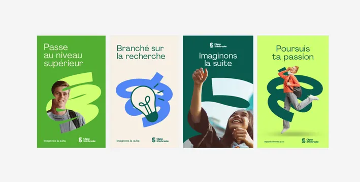
Four-poster campaign for a Quebec college unified by a hand-drawn spiral mark that flexes between graphic, photo frame, and logo glyph across a vibrant green palette.
Summary
Four vertical posters for Cegep Sherbrooke unified by a loose, ribbon-like spiral mark that shifts between a flat graphic, photo-cropping frame, and logo glyph across lime, cream, forest-green, and acid-yellow backgrounds.
Visual description
Four tall posters in a grid, each a different bright green (lime to forest to acid yellow). A hand-drawn spiral appears on all four as the recurring device: sometimes filled flat, sometimes curving around a student headshot, once paired with a flat blue lightbulb icon. French headlines in a rounded sans-serif sit at top (Passe au niveau superieur; Branche sur la recherche; Imaginons la suite; Poursuis ta passion). Candid student photography: a smiling portrait, a jumping figure mid-motion, hands raised. The Cegep Sherbrooke logo lockup with its S-spiral icon anchors the bottom of each poster. The tagline Imaginons la suite repeats on all panels.
Key takeaway
A single ownable mark (the spiral) that is flexible enough to work as a solid graphic, a photo-cropping frame, and the logo itself; this multi-purpose approach gives institutional branding visible consistency without repetition fatigue. The graded green background (not a fixed single color) creates visual progression across the series while the repeated mark, tagline, and logo lockup anchor recognition.
Reuse notes
Strong model for educational or youth-program branding that needs motion and approachability over corporate polish. The key move is making the mark do multiple jobs at once. Works especially well when the organization can pair the system with energetic, candid photography and afford a restricted but vibrant color palette per panel.