Preview image. Unlock full-res
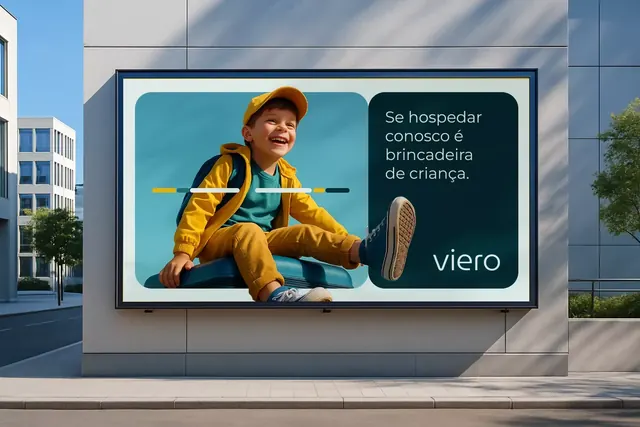
Outdoor billboard for Viero brand featuring a child in bold yellow jacket against turquoise, split with dark navy brand panel and Portuguese copy.
Summary
A commercial billboard for Viero using split composition: a child in bright yellow jacket and cap against a turquoise backdrop dominates the left, while navy blue brand panel on the right holds Portuguese copy and a horizontal accent line in yellow and teal.
Visual description
The layout splits vertically at roughly the midpoint. Left half: a joyful child seated on a turquoise circle background, wearing a bold yellow jacket, blue shirt, and matching yellow cap; a horizontal line in yellow, white, and navy crosses the body as a design element. Right half: deep navy rectangle with white sans-serif text reading "Se hospedar conosco é brincadeira de criança" (lodging with us is child's play), and the wordmark "viero" in white. The palette uses high contrast between warm yellows and cools teals, creating visual energy and approachability. Architectural setting visible in the background.
Key takeaway
The split-panel strategy separating narrative image from copy reduces cognitive load and works well on large formats. The horizontal line element connecting both halves ties the composition together. Color pairing of warm yellow and cool teal reads as modern hospitality without being saccharine.
Reuse notes
Well-suited to tourism, hospitality, and family-focused brands. The character-driven imagery works because the child's pose and expression feel natural, not overly styled. Scale this to outdoor OOH (billboards, transit shelters, facade displays). Watch that the right panel has enough breathing room for international copy lengths.
More like this

Keep what you find
A free account saves references to boards and can send you a weekly email of picks based on what you save.
To see every result, go Pro.