Preview image. Unlock full-res
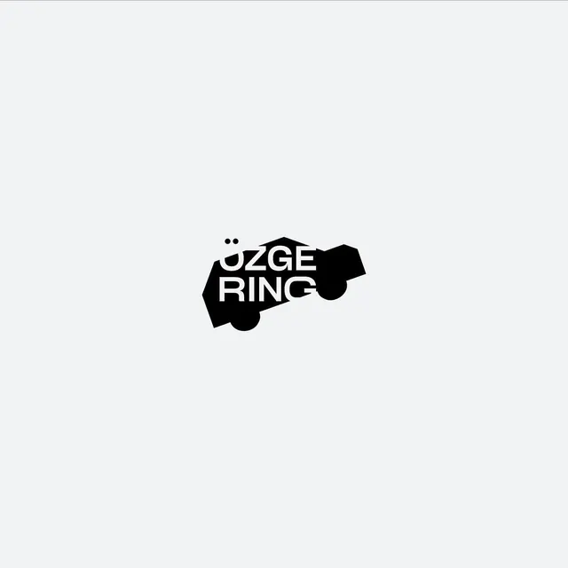
A wordmark reading OZGE RING set in white inside a solid black side-profile car silhouette, with the headlight and wheels doubling as letterform dots.
Summary
A car-silhouette wordmark logo where a solid black side-profile car shape holds a two-line white wordmark, and the headlight and round wheels stand in for the letterform dots above the type.
Visual description
A small black mark sits centered on a pale gray field with generous surrounding space. The black shape reads as the side profile of a car: an angular cabin and hood up top, two circular wheels at the base. Inside it, a tight all-caps sans-serif wordmark is knocked out in white across two lines, the second line slightly narrower than the first. The two dots of the umlaut on the first character align with the car's headlight, and the round wheels echo the same dot motif, tying the typography and the vehicle silhouette into one continuous form. No color, no gradient, no secondary elements.
Key takeaway
Letting a literal object silhouette become the container for knocked-out type, so the picture and the name are a single mark rather than icon-plus-text. Reusing repeated circles (headlight, wheels) as both vehicle detail and typographic punctuation is the clever move worth borrowing.
Reuse notes
Reach for this when a brand name needs an instantly readable category cue (here, automotive or motoring) baked into the logotype itself. Works best as a compact monochrome mark on neutral backgrounds; the knockout type needs a high-contrast solid shape to stay legible at small sizes.