Preview image. Unlock full-res
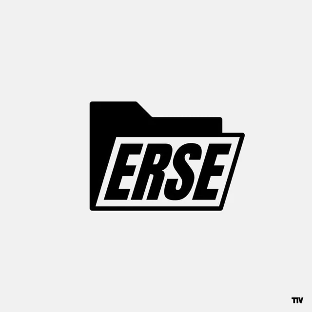
Black folder icon with italic sans-serif wordmark, bold high-contrast monochrome logo on light background.
Summary
A two-part monochrome logo combining a tilted folder shape with a condensed italic sans-serif wordmark, creating a stark tech-industry identity.
Visual description
A light gray background hosts a black folder silhouette in the left third, its edges clean and geometric. The word "ERSE" sits overlaid in a parallelogram frame, rendered in heavy italic sans-serif that slopes rightward, the strokes bold enough to command immediate attention. The frame is just slightly askew, creating subtle tension. Zero ornamentation, pure negative space, and extreme high contrast between the solid blacks and the off-white background.
Key takeaway
The marriage of geometric symbol (folder) with tilted typography creates motion and memorability in a minimal space. The italic angle does design work on a static mark, making it feel forward-leaning and contemporary. The lack of a stroke or gradient keeps the impression permanent and versatile.
Reuse notes
Ideal for software, developer tools, or design platforms where a sense of modern efficiency is required. The monochrome treatment guarantees legibility at any scale and works on both light and dark backgrounds. Avoid recoloring the tilted elements unless the entire brand system tilts with it.