Preview image. Unlock full-res
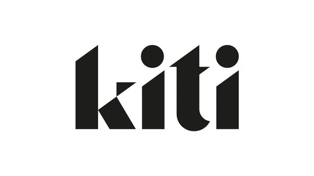
A black lowercase kiti wordmark cut from angular geometric forms, where sliced diagonals and a stencil gap turn a four-letter logo into a sharp custom display face.
Summary
A solid-black lowercase "kiti" logotype built from chunky geometric letterforms, where each character is sculpted by a diagonal slice or a stencil gap rather than drawn from a standard typeface.
Visual description
Centered black lettering on a clean white field. The forms are heavy and engineered: the "k" leg is cut by a sharp diagonal, the two "i" stems are topped by perfect circular dots, and the "t" crossbar is sheared on an angle. Counters and terminals are squared and decisive, with a faint stencil-style break separating the bowl of one letter. No tagline, no mark, no color, just the word, so the personality lives entirely in how the letters were constructed.
Key takeaway
Cutting angular slices and stencil gaps into otherwise plain geometric letters gives a wordmark a custom, drawn-not-typed feel without exotic decoration. Circular dots against straight cuts add a small playful counterpoint that keeps it from reading as cold.
Reuse notes
A good reference when a short brand name needs a distinctive logotype that still feels modern and legible. Works for tech, studio, or product brands. Reproduces cleanly at small sizes and in single color; the construction logic should extend to the rest of an alphabet if it becomes a system.