Preview image. Unlock full-res
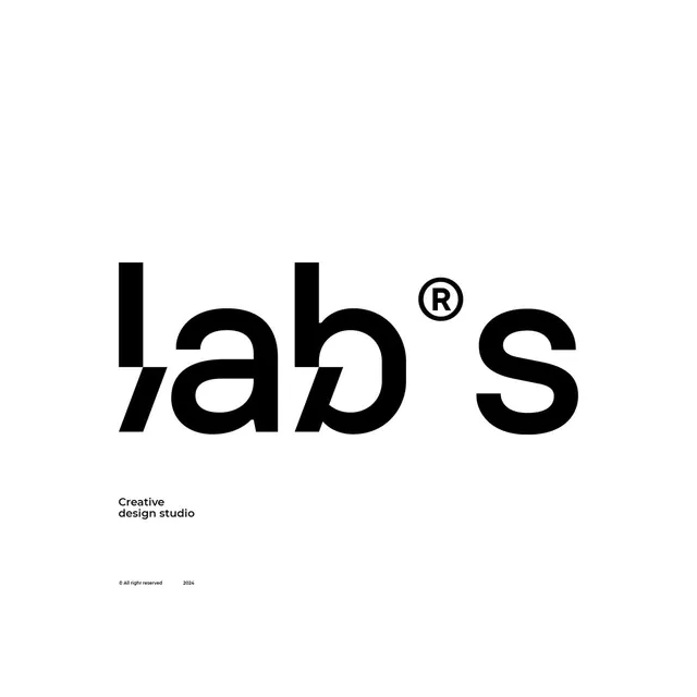
A black-on-white 'lab's' logotype where the letters overlap and interlock at the baseline, with a circled R sitting where an apostrophe would, labeled a creative design studio.
Summary
A large black "lab's" logotype on white where the lowercase letters slide into and overlap one another at the foot of the word, and a circled R takes the apostrophe's slot. A small "Creative design studio" descriptor anchors it bottom-left.
Visual description
The wordmark fills the upper-center of a white canvas in very heavy black lowercase. The "l", "a", and "b" do not sit on a shared baseline; instead their lower strokes cross and tuck behind each other, creating sliced negative-space gaps between glyphs. A registered-trademark symbol floats high between the "b" and the "s", reading as a punctuation accent rather than legal fine print. Far below, in small bold sans, sit "Creative / design studio" and a faint copyright line with the year. The rest of the frame is empty white.
Key takeaway
The interlocking, off-baseline letterforms turn a four-character word into a single connected mark, so it behaves like a monogram while still being readable. Promoting the registered-R into the composition as a design element is a clever way to add a stylistic accent for free.
Reuse notes
Ideal for a studio or agency that wants a confident type-only identity with built-in craft. The overlap needs careful spacing tests at small sizes, the sliced gaps can clog or look like a font-rendering error if scaled down too far. Pairs well with a stark monochrome system and lots of white space.