Preview image. Unlock full-res
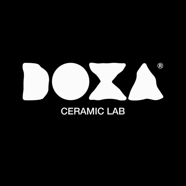
A white-on-black logo for DOXA Ceramic Lab whose custom wordmark turns each letter into a soft, hand-thrown ceramic blob, set above a clean spaced-out descriptor.
Summary
A centered white-on-black logo for DOXA Ceramic Lab. The defining move is a fully custom display wordmark where every letter is softened into a rounded, lumpy form that looks hand-pinched from clay.
Visual description
On a solid black square, the word DOXA dominates in heavy white all-caps, but the letterforms are warped into organic blobs: the D and O bulge irregularly, the X pinches at a soft waist, and the A swells like a thumbed lump of clay, with rounded, uneven contours throughout. A small registered-trademark R floats at the top right of the final letter. Beneath the wordmark, in stark contrast, sits the descriptor CERAMIC LAB in a precise, evenly tracked geometric sans, all caps and much smaller. The pairing plays a tactile, irregular display face against a crisp, mechanical subtitle.
Key takeaway
Encoding the product (ceramics) directly into the letterform language, so the wordmark itself looks thrown and pinched from clay. Anchoring that playful, organic display type with a tightly tracked geometric descriptor keeps the lockup from feeling sloppy and signals craft plus precision at once.
Reuse notes
A template for any maker, studio, or craft brand wanting its medium expressed in the type itself (clay, glass, wax, paper). The high-contrast black-and-white pairing is strong for stamps, packaging, and signage. The blob wordmark needs the clean descriptor to stay legible at small sizes; on its own it can read as illegible at favicon scale.