Preview image. Unlock full-res
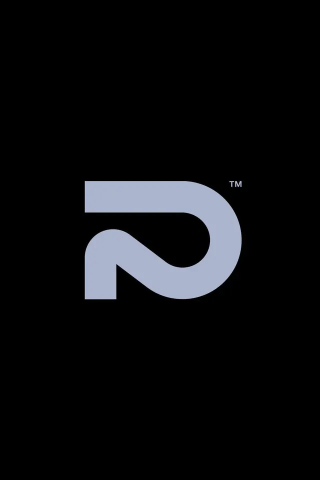
A rounded monoline letter D logomark in muted lavender-gray on black, where the counter folds into a continuous looping path that reads as an infinity or figure-two motif.
Summary
A single uppercase D logomark drawn as one constant-width rounded stroke, with its interior counter folding back on itself so the bowl reads simultaneously as a D, an infinity loop, and a figure two.
Visual description
The mark sits dead-center on a pure black field with generous surrounding space. It is rendered in a soft, desaturated lavender-gray, a single flat tone with no gradient. The stroke is uniform monoline weight with fully rounded terminals and the right side bulges into a wide teardrop curve. Inside, the negative space carves a second looping path that crosses back through the form, turning the closed counter into an interlocking ribbon. A small superscript trademark glyph sits at the upper right of the mark. There is no wordmark or supporting type.
Key takeaway
The single-stroke construction that lets one letter carry two readings at once: the D silhouette plus an infinity loop hidden in its counter. The constant stroke width and rounded caps keep it feeling friendly and modern rather than cold, and the trademark glyph alone signals a finished brand identity.
Reuse notes
A strong starting point for a tech or product brand whose name starts with D, or any identity that wants to imply continuity, cycles, or connection. Works best as a solid one-color mark; the looping counter could lose legibility at very small sizes, so test the favicon scale.