Preview image. Unlock full-res
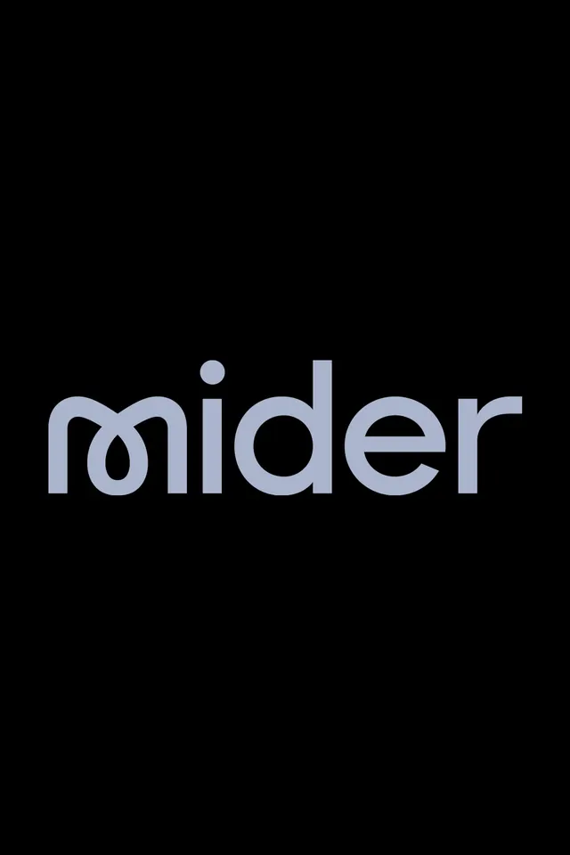
A lowercase mider wordmark set in a soft rounded geometric sans, periwinkle grey on black, with a looped joined m as its signature detail.
Summary
The lowercase wordmark "mider" centered on a black field in a soft rounded geometric sans, its defining trick a custom m whose first two strokes loop into a single continuous curve instead of separate verticals.
Visual description
A pure black background with the single word mider centered, set in muted periwinkle grey. The typeface is a geometric sans with generously rounded terminals and near-circular bowls on the d and e. The lead m is drawn as a ligature: the first arch flows into a closed teardrop loop rather than two plain stems, giving the mark a handwritten swell at the start that the rest of the rigid letters do not have. Even weight throughout, wide spacing, no descenders, nothing else in frame.
Key takeaway
Customize one letter and leave the rest of the wordmark stock-geometric. Here only the m is reworked into a looped ligature, and that single intervention carries the whole identity while keeping the logotype legible. The cool grey on black instead of pure white reads softer and more premium than maximum contrast would.
Reuse notes
A clean template for a tech, SaaS, or consulting logotype where you want approachability without going playful. Works best reversed on dark as shown; test the looped m at small sizes since the closed loop can fill in. Pair with the same rounded sans for body type or contrast it against a neutral grotesque.
More like this




Keep what you find
A free account saves references to boards and can send you a weekly email of picks based on what you save.
To see every result, go Pro.