Preview image. Unlock full-res
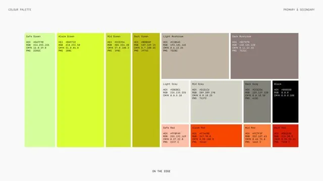
A brand color specification page laying out greens, mushroom neutrals, and reds as labeled blocks, each with HEX, RGB, CMYK, and PMS values in monospace.
Summary
A brand-guideline color page that arranges the full primary and secondary palette as labeled blocks, every swatch carrying its name plus HEX, RGB, CMYK, and PMS values in small monospace.
Visual description
A near-white page with the running heads "COLOUR PALETTE" top-left and "PRIMARY & SECONDARY" top-right, and "ON THE EDGE" centered at the foot. Four tall green swatches run down the left, stepping from a bright lime through to a dark olive. The center and right are a mixed-height grid: a row of warm mushroom and gray tones (light to dark plus pure black) and a bottom row of four reds graduating from a pale safe red to a deep alarm red. Each block is tagged with a short name and a four-line spec stack of HEX, RGB, CMYK, and PMS codes set in tiny monospace, aligned to the top-left corner of every swatch.
Key takeaway
Sizing swatches by importance rather than on a uniform grid, so primary greens get tall columns while neutrals and supporting reds sit in smaller cells, gives a palette page visual hierarchy at a glance. Locking the same four-line HEX/RGB/CMYK/PMS stack into the corner of every block makes the sheet read as engineering documentation, not decoration.
Reuse notes
A clean template for the color page of a brand guideline or design-system doc, especially when print PMS matching matters alongside screen values. Works best with named swatches so colors can be referenced in copy. Keep the monospace tiny and consistent; the credibility comes from the spec discipline, not from large type.
More like this







Keep what you find
A free account saves references to boards and can send you a weekly email of picks based on what you save.
To see every result, go Pro.