
Preview image. Unlock full-res
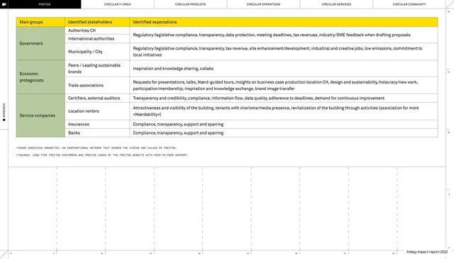
An 86-slide sustainability and impact report built on a strict Swiss grid, FREITAG yellow and black, a sans/monospace type pairing, and recurring blueprint detailing that frames every chart, diagram, and divider as an engineering document.
Summary
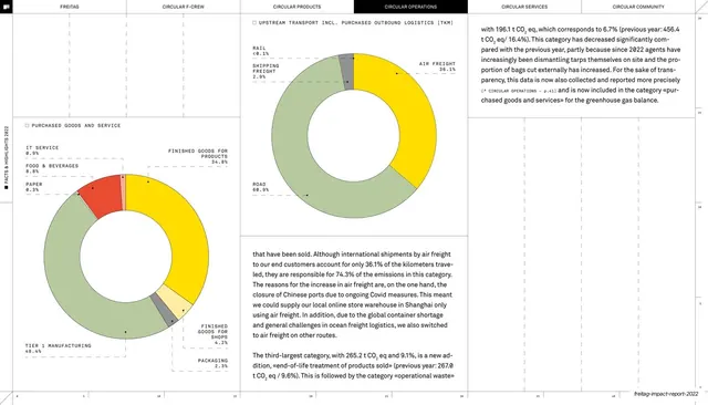
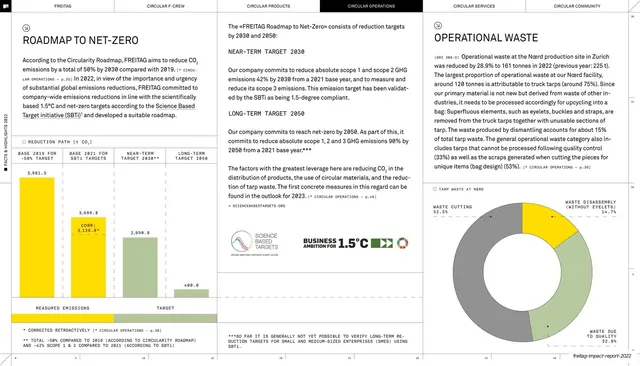
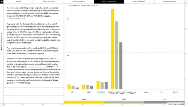
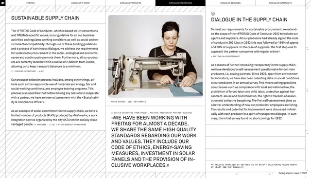
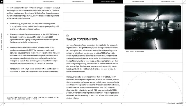
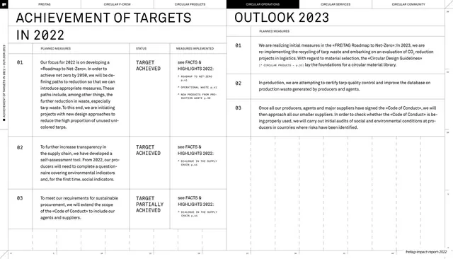
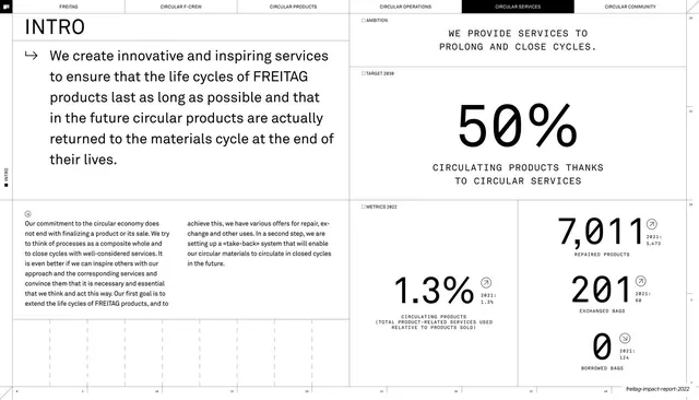
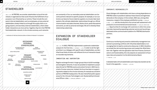
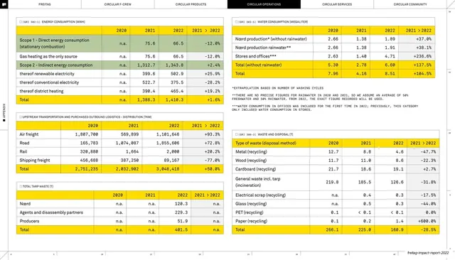
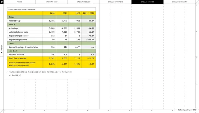
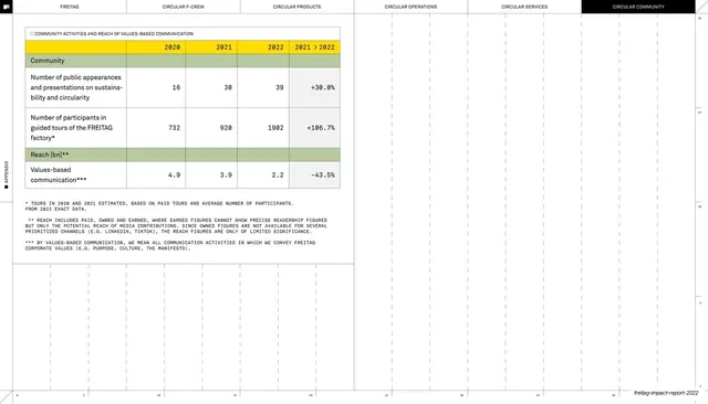
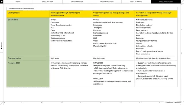
FREITAG's 2022 Impact Report: a sustainability and circular-economy report for customers, partners, and stakeholders, organised around a five-direction Circularity Roadmap (Circular F-Crew, Products, Operations, Services, Community). Its design is pure Swiss-technical: a relentless hairline grid, the brand's signature yellow with black on white, a humanist sans paired with a monospace utility face, and blueprint detailing that makes every page feel like an engineering drawing. (18 of the deck's 86 slides are described locally.)
Visual description
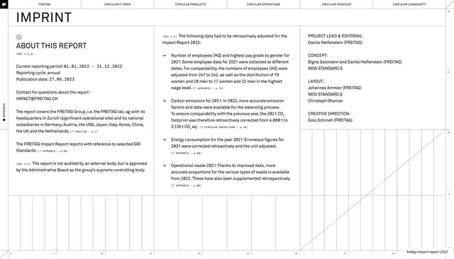
Slides run 16:9. The palette is FREITAG yellow (#FFD200), black, and white, with a deliberately muted earthy support set (sage green, terracotta, grey, plus the official UN SDG colours) reserved for data and icons. Two type systems run throughout: a neo-grotesque sans (Helvetica-like) for headlines, oversized statement type, and body copy, and a monospace face for small all-caps utility labels, sub-headings ("PRIVATELY OWNED", "AMBITION", "TARGET 2030"), GRI reference tags ("[GRI 2-22]"), photo credits, and chart titles. Guillemets («») wrap mission lines and quotes.
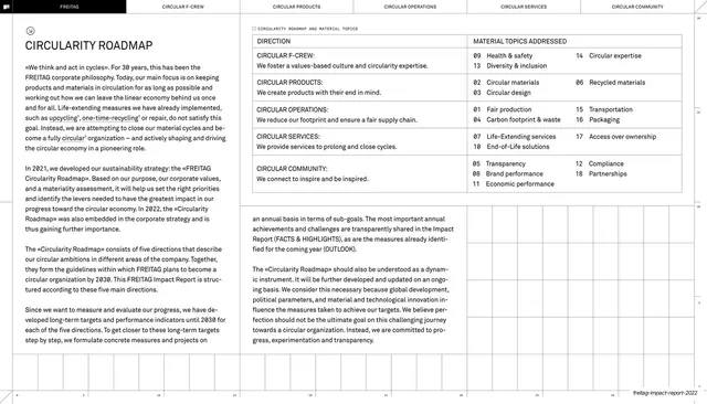
The structural grammar is consistent and distinctive: a black boxed "FREITAG" flag logo top-left, a six-tab section navigation across the top (FREITAG, CIRCULAR F-CREW, CIRCULAR PRODUCTS, CIRCULAR OPERATIONS, CIRCULAR SERVICES, CIRCULAR COMMUNITY) with the active tab inverted to black, thin hairline rules dividing every spread into columns and rows, a faint numbered ruler scale along the edges, and a diagonal-hatch border framing many content spreads. Circled markers tag section headings.
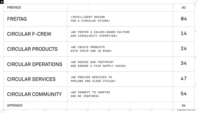
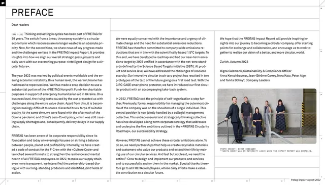
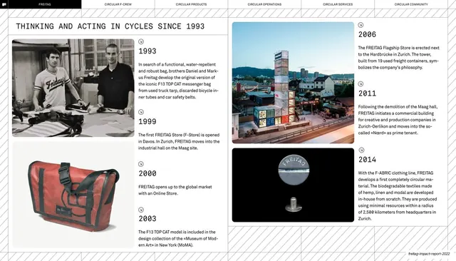
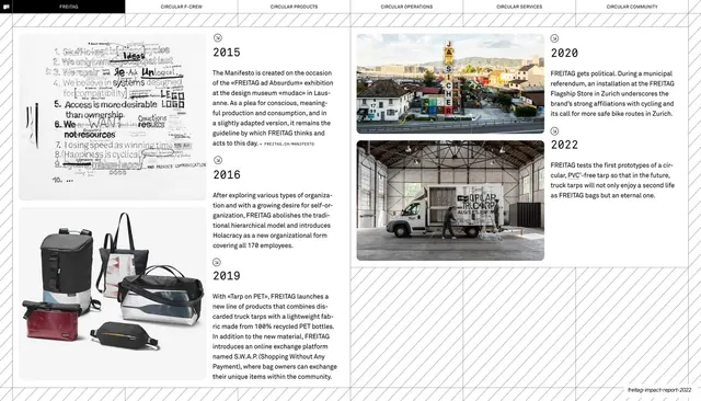
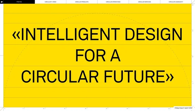
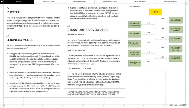
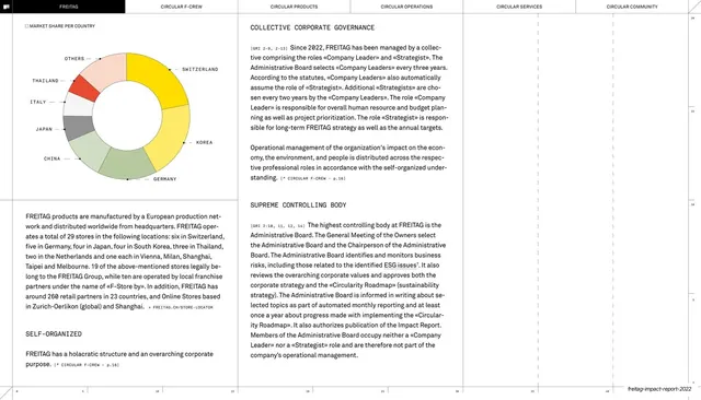
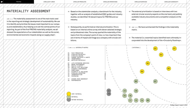
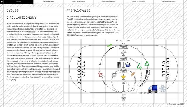
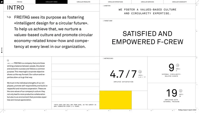
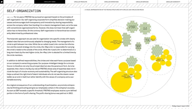
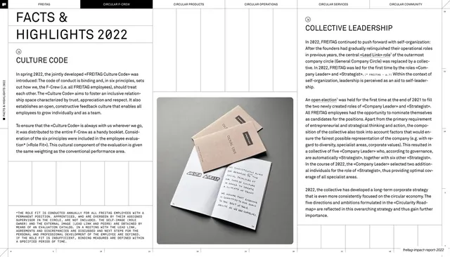
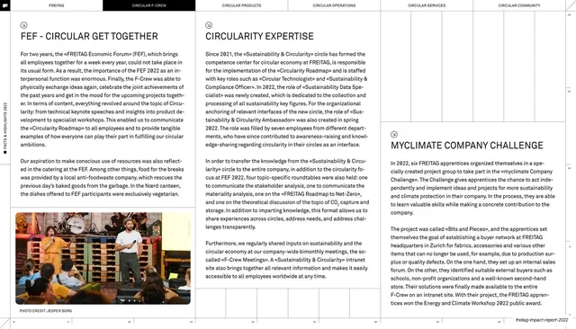
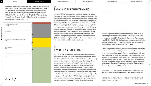
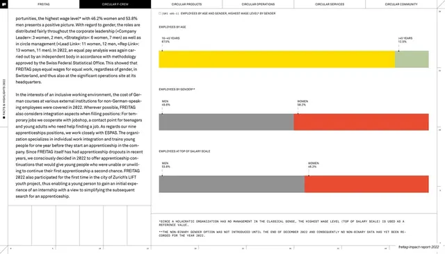
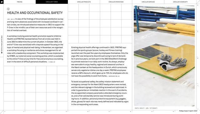
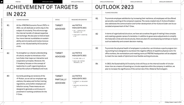
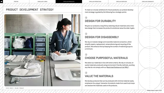
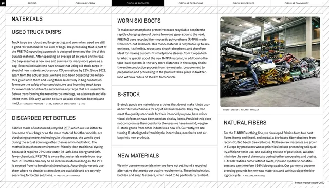
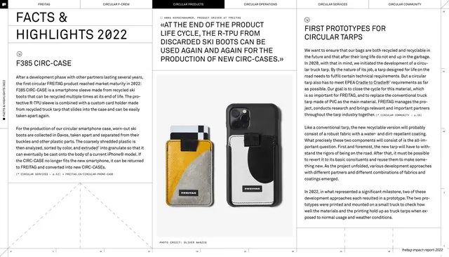
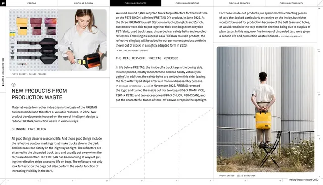
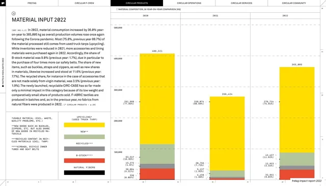
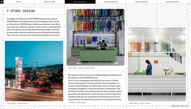
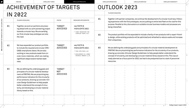
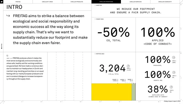
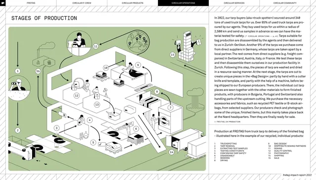
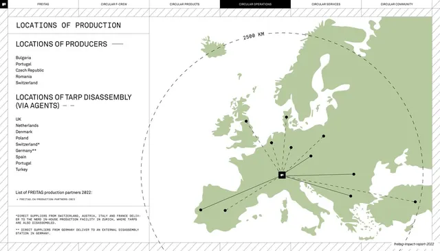
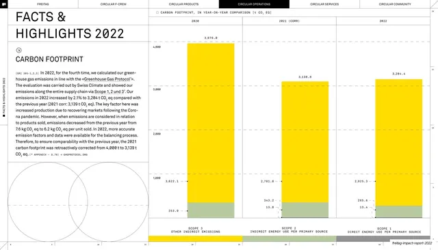
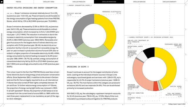
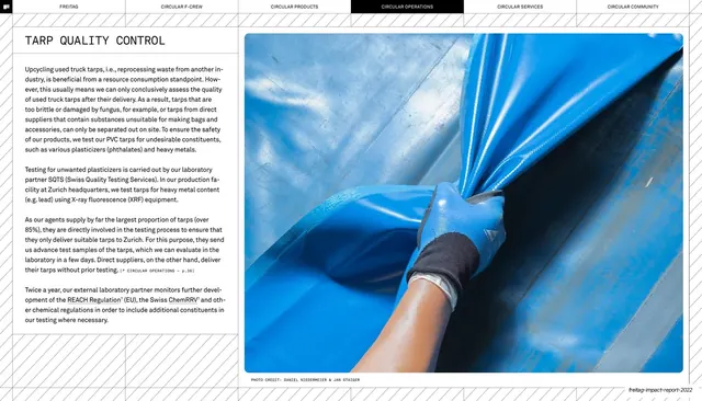
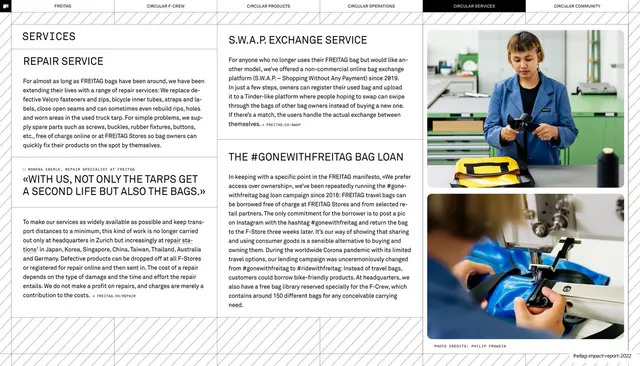
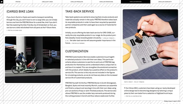
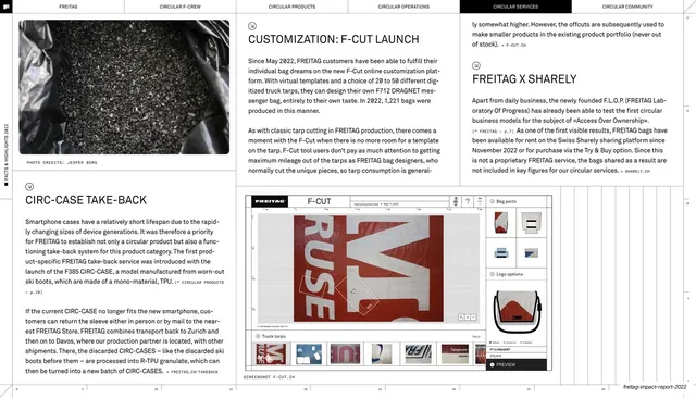
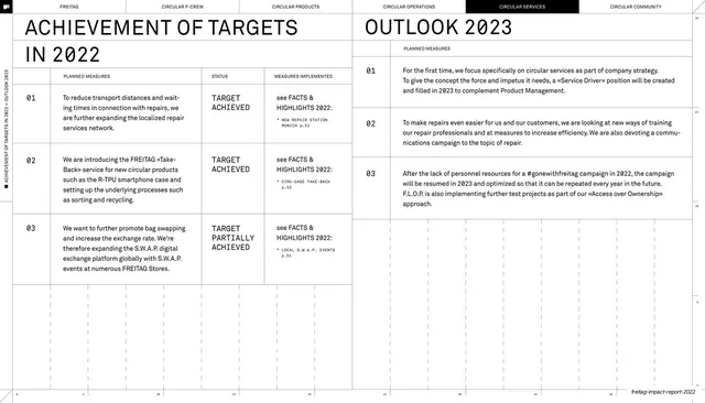
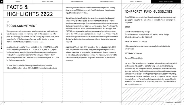
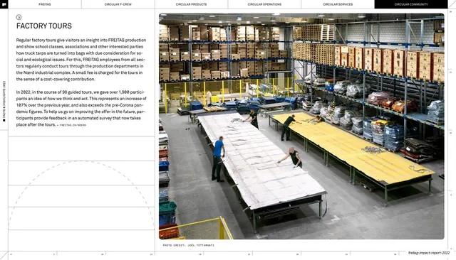
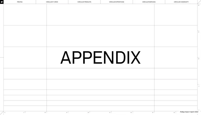
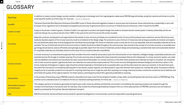
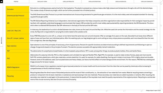
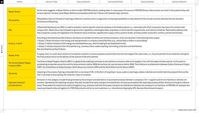
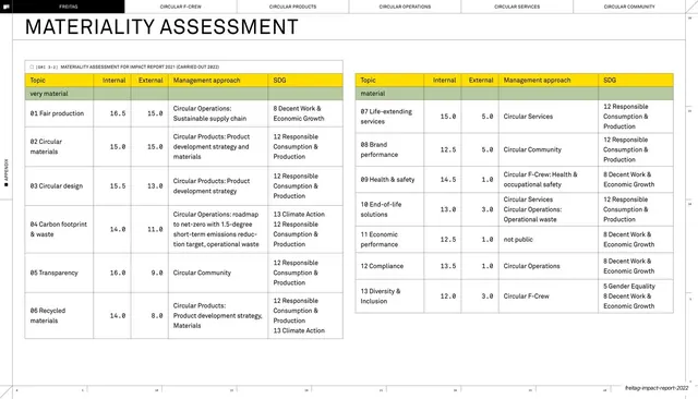
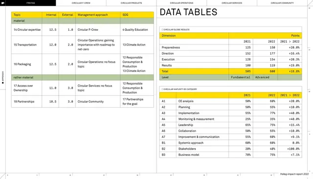
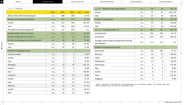
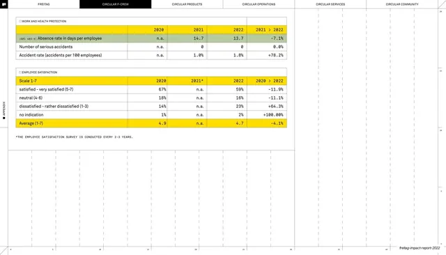
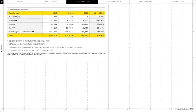
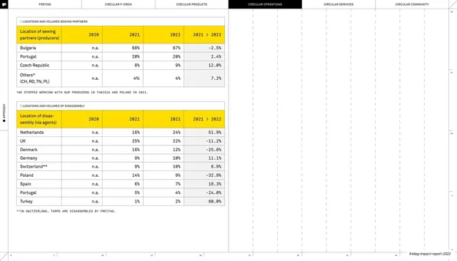
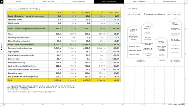
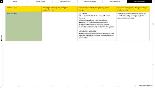
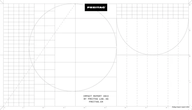
Recurring slide types: a full-bleed yellow cover and yellow quote/statement slides with oversized black type over a faint blueprint grid of dashed circles; a strict contents table mapping section name to guillemet mission line to page number; dense three- and four-column editorial spreads of justified body copy with inline GRI tags; metric-led intros built from a monospace ambition label, an oversized aspirational statement, and a strip of big-number KPIs with prior-year deltas; and data slides carrying a single donut chart, materiality matrix, bar chart, ownership tree, bubble diagram, or twin-loop circular-economy infographic, each in the muted support palette. Chapter dividers are bespoke technical drawings of a single object (a yellow coil for "F-Crew") with the section title overlaid. Photography appears sparingly: archival black-and-white founder shots, muted product and workshop images, and warm candid team photos, always one or two per spread.
Key takeaway
The whole report is a lesson in running one rigid system across dozens of dense pages without fatigue. The strongest moves: a persistent six-tab section header plus ruler scale and hairline grid that make every spread feel like one engineered document; reserving the loud brand yellow for covers, dividers, and statement type while pushing all data into a sober muted palette so charts never shout; the sans/monospace pairing that signals "editorial and audited" at once, with inline GRI tags proving rigour without disrupting the read; oversized single statements and big-number KPIs as the rhythmic relief between text walls; and turning each chapter divider into a custom blueprint illustration so the breakpoints become the most memorable slides.
Reuse notes
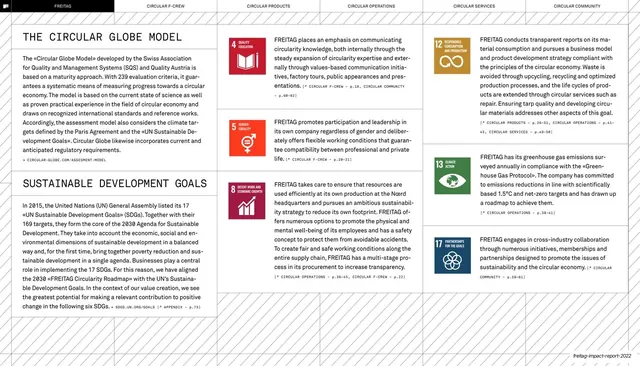
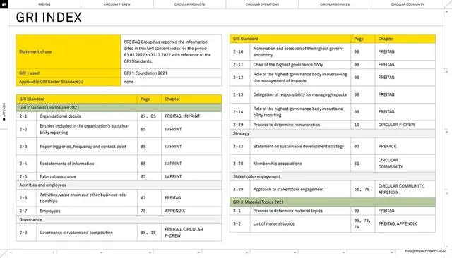
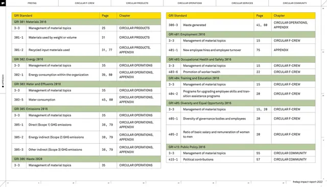
A reference-grade template for sustainability, impact, ESG, or annual reports, and for any long, data-heavy document that must stay legible and on-brand across 80-plus pages. The contents table, metric-led chapter intros, materiality matrix, SDG-alignment list, and editorial content grid are all directly liftable. It demands real substance to fill: genuine body copy, real KPIs with comparators, actual photography, and a strong single brand colour. The monospace-label and blueprint-grid mannerisms read as technical and Swiss; lean into them only if that tone fits the brand. Best paired with the kind of audited, standards-referenced content (GRI, SDGs) it is built to carry.
From this deck: FREITAG Impact Report 2022
View deck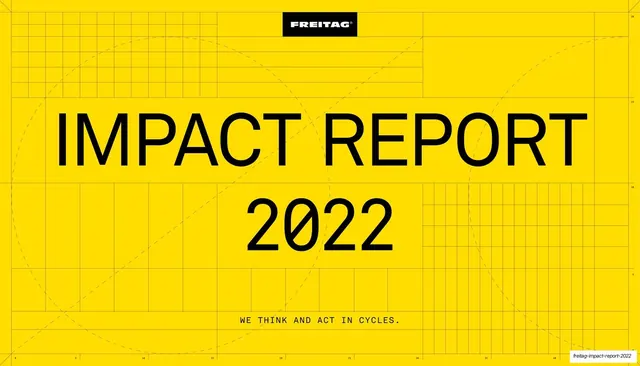














More like this







Keep what you find
A free account saves references to boards and can send you a weekly email of picks based on what you save.
To see every result, go Pro.