Preview image. Unlock full-res
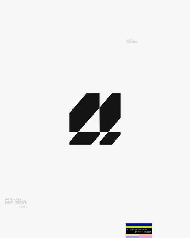
A black abstract monogram for LUMN, a payment-orchestration software brand, built from angled slabs sliced by thin negative-space gaps on a pale field.
Summary
A logo-design presentation sheet for "LUMN," labeled as a payment-orchestration software brand, dated 2026. A single bold black monogram sits centered on an off-white field, assembled from angled rectangular slabs separated by thin diagonal cuts of negative space.
Visual description
The page is a tall pale-cream field, almost empty. Centered is the mark: heavy black geometric forms, roughly reading as an "M" or interlocked uprights, made of four or five parallelogram slabs whose edges are sheared at a consistent angle and pulled slightly apart so the background slips through as crisp diagonal seams. Small monospaced captions sit in the corners ("[ LUMN ] LOGO DESIGN" top-right; a project note and "[ 2026 ]" bottom-left). A small studio credit block and a stack of colored swatches (blue, lime, yellow, blush, lavender) anchor the bottom-right, the only color on the page.
Key takeaway
Cutting a solid letterform into slabs with thin angled gaps gives a mark motion and a sense of routing or flow, fitting for payments infrastructure, while staying a single flat color. The vast empty field plus tiny monospaced corner labels frames the logo like a museum specimen.
Reuse notes
A reference for fintech, developer-tool, or infrastructure brands wanting a precise, engineered monogram rather than a literal icon. The sliced-gap technique scales down well to favicons because the seams stay legible. Pair with a tight monospaced or grotesque type system as shown.