Preview image. Unlock full-res
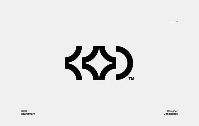
A black KOD brandmark built from thick curved blades and a central four-point star of negative space, presented centered on a light grey field.
Summary
A black geometric brandmark for KOD that reads as the letters K, O and D through thick curved blades, with a crisp four-point star carved out of the negative space at its center.
Visual description
The mark sits centered on a flat light grey board. It is built from heavy black shapes with quarter-circle cutouts: a leftward chevron of curved blades suggesting a K, a diamond of negative space forming a star at the middle, and a half-ring closing the right side like a D, with a small TM mark at its lower right. Thin presentation-board labels frame the mark: a small "7" with a dash at the top right, "KOD / Brandmark" set in a tight sans at the bottom left, and "Designer / Jen Ditters" at the bottom right. The palette is strictly black on grey.
Key takeaway
Using consistently weighted curved cutouts so several letters share one geometric DNA, and letting the gaps between them resolve into a positive shape (the central star). The understated portfolio-board framing, a corner index number plus mark name plus credit, is a clean way to present a single logo.
Reuse notes
A reference for a monogram or single-letter-family brandmark where negative space does double duty as a secondary symbol. The curved-blade construction scales well to a favicon or app icon. The board layout itself is reusable as a template for presenting any one mark in a case study or logo grid.