Preview image. Unlock full-res
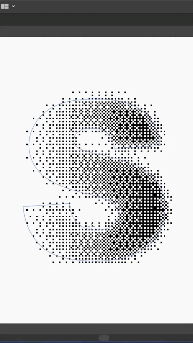
A serif letter S rendered as a square halftone dot grid, captured inside a design app with its bezier outline path still visible over the dots.
Summary
A single serif letter S built from a grid of small black squares whose density gradient gives the letterform volume, shown mid-edit in a vector app with the underlying spline outline overlaid in thin blue.
Visual description
Centered on a near-white canvas, the S is described not by a solid fill but by a regular grid of tiny black square dots. The dots cluster densely along the right and lower curves of the letter and thin out toward the upper-left and the edges, so the halftone density reads as light and shadow shaping a thick serif S. A faint blue bezier path traces the true vector outline of the glyph, including the two counters, revealing this is a working screenshot rather than a finished export. Dark UI chrome bars frame the top and bottom of the vertical, phone-proportioned crop. The whole thing is black, white, and grey only.
Key takeaway
Driving a halftone dot grid by local density (tight dots for shadow, sparse for highlight) turns a flat letterform into something with implied dimension while staying purely two-tone and print-friendly. Keeping the visible bezier outline is itself a look: process-as-aesthetic that signals craft and the act of construction.
Reuse notes
Good for a lettermark, monogram, or studio identity wanting a tactile, screen-printed or risograph feel without any color. Square dots read more digital and brutalist than round stipple. The exposed editing outline suits process-led portfolio or agency contexts; crop it out if you need a clean final mark.