Preview image. Unlock full-res
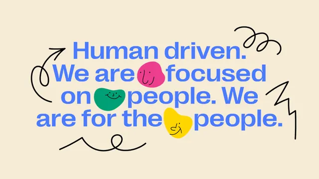
A people-first brand statement set in heavy blue sans-serif, with three smiling colored blobs and black hand-drawn doodles tucked between the words on a cream ground.
Summary
A warm, people-first headline, Human driven. We are focused on people. We are for the people, set in heavy cobalt sans-serif with three smiling blobs and loose black doodles standing in for emphasis.
Visual description
On a cream ground, four lines of bold rounded sans-serif in bright cobalt blue fill most of the frame, left-aligned and tightly leaded. Three organic blob shapes, magenta, green, and yellow, each wearing a simple drawn smiley face, are slotted directly into the text flow where words would sit. Surrounding the type are hand-drawn black line doodles: a curling arrow, a coiled spring spiral top-right, a sharp zig-zag, and a looping underline. Everything is flat with no shadow, giving a sticker-and-marker feel.
Key takeaway
Replacing select words with smiling blob characters inside a running headline, so the copy and the mascot system are the same element. The mix of one heavy geometric typeface with loose hand-drawn marker doodles is what makes a flat layout feel human and energetic.
Reuse notes
Ideal for an HR, culture, or community-driven brand that wants to read warm rather than corporate. The blob-faces double as a flexible illustration kit across other assets. Keep the doodles sparse; crowd them and the headline stops being legible. Works best when the type color and blobs share a high-saturation palette over a neutral cream.
More like this
Keep what you find
A free account saves references to boards and can send you a weekly email of picks based on what you save.
To see every result, go Pro.