Preview image. Unlock full-res
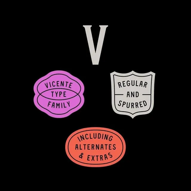
A playful type-specimen identity for the Vicente Type Family, displaying the large letter 'V' and three colorful rounded badge labels outlining font variants.
Summary
A playful type-specimen identity for the Vicente Type Family, displaying the large letter 'V' and three colorful rounded badge labels outlining font variants.
Visual description
At the top center sits a large, minimalist serif or geometric display letter 'V' in off-white against the black background. Below are three stacked rounded badge shapes, each with a distinct color and text: a bright magenta/pink pill-shaped label reads "VICENTE TYPE FAMILY" with concentric oval lines; a cream-colored shield-shaped badge says "REGULAR AND SPURRED"; an orange-coral rounded rectangle states "INCLUDING ALTERNATES & EXTRAS". Each badge uses clean sans-serif type oriented horizontally, and all elements are centered on the black field. The layout is vertical and well-spaced, with clear visual separation between the specimen mark and the product labels.
Key takeaway
The badge system for communicating variant information is both instructive and memorable. The rounded, organic shapes soften the minimalism while remaining professional. The color strategy (bright magenta, coral, cream) creates visual excitement without complexity. Centering and consistent spacing make the layout feel intentional and complete.
Reuse notes
Useful for typeface families or modular design systems that need to communicate multiple variants without cluttering the display. The playful badge approach works well for contemporary, design-forward, or creative brands that want personality alongside clarity. The color-coded variant labels could be adapted for other product families (sizes, formats, substrates). Works best when you want to combine minimal aesthetics with approachable, friendly communication.
More like this



Keep what you find
A free account saves references to boards and can send you a weekly email of picks based on what you save.
To see every result, go Pro.