Preview image. Unlock full-res
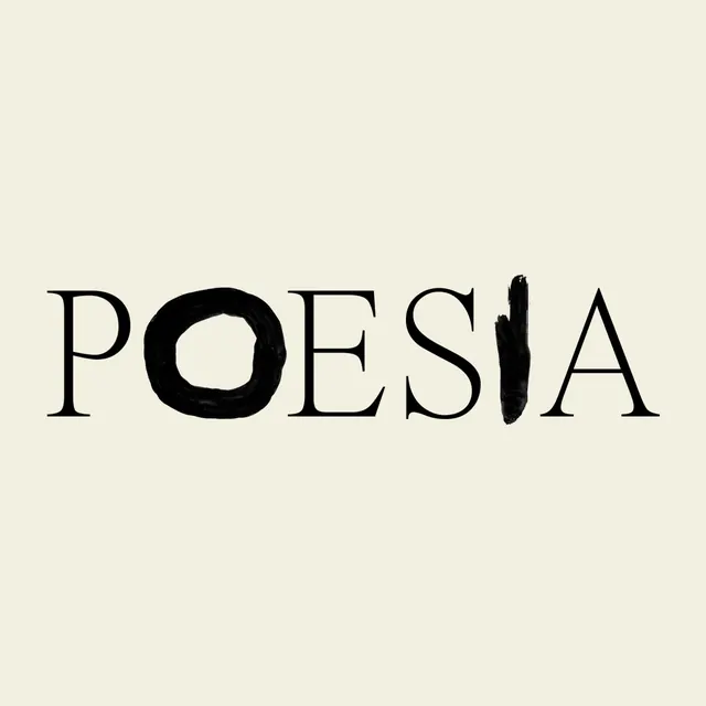
The wordmark POESIA set in a thin contrast serif on cream, with the O swapped for a hand-painted ink ring and the I replaced by a single rough brushstroke.
Summary
The single-line wordmark POESIA, centered on a warm cream square. Most letters are a refined high-contrast serif, but two glyphs are hand-painted in ink: the O is a rough brushed circle and the I is a wet vertical brushstroke, breaking the typographic order on purpose.
Visual description
Black caps on an off-white, slightly textured cream field with generous margins all around. The P, E, S, and A are drawn in a thin, sharp-bracketed serif with strong thick-thin contrast and a high waist on the S. Set among them, the O is replaced by a hand-inked ring with visible open ends and an uneven weight, and the I is a single tapering brushstroke that reads heavier and looser than its neighbors. The mix of precise typeface and gestural marks sits on one baseline, perfectly horizontal and balanced.
Key takeaway
Keep a clean serif logotype mostly intact, then substitute one or two letters with hand-painted ink forms so the mark carries a human, made-by-hand signal without abandoning legibility. Choosing round and vertical glyphs (O and I) makes the swap obvious yet still readable as the word.
Reuse notes
Ideal for literary, arts, fragrance, or cultural identities that want craft and warmth over slickness. The effect depends on real brush texture, vector-smoothing the strokes kills it. Reserve the painted glyphs for the primary wordmark and pair with the plain serif for supporting type.
More like this



Keep what you find
A free account saves references to boards and can send you a weekly email of picks based on what you save.
To see every result, go Pro.