Preview image. Unlock full-res
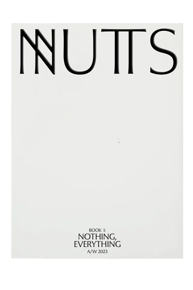
Minimalist editorial cover deploying massive display type at top with subsidiary metadata and collection title stacked low on a light background.
Summary
Editorial cover using a single oversized display typeface with supporting text anchored at the foot, leaving the majority of the composition as breathing room.
Visual description
Beige-white background with a clean-edged rectangular border frame. The word "NNUTTS" (or similar; letterforms are serif and lowercase) stretches across the upper two-thirds in a monumental sans-serif or slab display cut. Below, positioned near the bottom right in smaller serif text, sits "BOOK 1:" followed by the subtitle "NOTHING, EVERYTHING" in all caps and an "A/W 2023" season marker. The layout is rigorously centered, with margins of nearly 40 percent empty space surrounding the typography, emphasizing restraint and editorial sophistication.
Key takeaway
The radical simplification of cover design into just type and whitespace builds authority through negative space alone. The contrast between the massive primary title and the delicate, small collection metadata creates immediate hierarchy without imagery. The serif typeface conveys editorial legitimacy while the symmetrical framing reads as contemporary, not historical. This approach works across media (print covers, digital headers, identity systems) because it relies on proportion rather than color or decoration.
Reuse notes
A strong template for editorial or luxury brands that want to avoid imagery and rely on typography and proportion for visual impact. Works well for book series, art publications, seasonal collections, or any context where restraint communicates confidence. Requires a confident typeface choice since nothing else shares the visual load. Avoid overcrowding the bottom information block; the sparse handling here is essential to the aesthetic. Fits both print and digital applications, scaling well from large posters to book covers.
More like this






Keep what you find
A free account saves references to boards and can send you a weekly email of picks based on what you save.
To see every result, go Pro.