Preview image. Unlock full-res
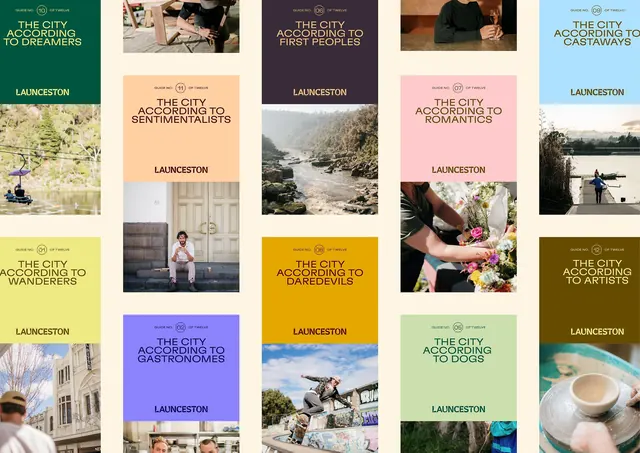
Ten-panel editorial grid presenting different city aspects (dreamers, sentimentalists, wanderers, etc.) paired with themed photography, muted earth-tone color backgrounds, and serif display typography.
Summary
A ten-panel editorial grid presenting Launceston through personified archetypes (dreamers, sentimentalists, wanderers, foodies, etc.), each paired with thematically matching photography, a muted earth-tone or pastel background, and serif display typography identifying the category.
Visual description
Ten rectangular panels arranged in two columns of five on a light cream background. Each panel pairs a labeled persona archetype set in large serif display type (often inclined or styled), with thematic photography: green fields for wanderers, couples for romantics, urban architecture for foodies, a street view for artists, merchandise for collectors, nature for gastronomers, a coffee cup for one category, a silhouetted couple for another. The color palette is constrained to warm earth tones (creams, dusty rose, olive, deep green, mustard yellow, pale blue, muted purple) with photography creating subtle contrast against solid color backgrounds. The "LAUNCESTON" text anchor appears consistently in each panel in a smaller sans-serif counterpoint to the display serif. The overall impression is sophisticated, grounded, and warm. The grid is modular but the varied panel content and color prevent monotony.
Key takeaway
The use of archetypal labeling and personification to make a geographic brand feel human and relatable. The pairing of display serif typography with photography as equal visual weight rather than hierarchy. The restraint in the color palette despite varying backgrounds. The consistent text anchor creating a subtle but reliable wayfinding cue across a diverse grid.
Reuse notes
Strong pattern for destination brands, cultural institutions, or organizations that want to show multiple facets or audience segments without an overwhelming visual system. Works well for editorial series, city/region branding, or lifestyle portfolio work. The muted palette keeps it sophisticated even when panels are densely packed. Best when each archetype or category is real and resonant to the audience.
More like this



Keep what you find
A free account saves references to boards and can send you a weekly email of picks based on what you save.
To see every result, go Pro.