Preview image. Unlock full-res
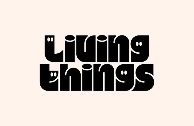
Simple wordmark spelling "play" in bold sans-serif on a warm peach background, emphasizing typographic form and negative space.
Summary
A minimalist wordmark using a single word set in bold sans-serif black type against a warm peach background, where the word itself is the only identity element.
Visual description
Large, geometric sans-serif letterforms span the full width of the peach background. The letters are solid black with uniform stroke weight. The composition is perfectly centered. Negative space is generous and balanced. The type treatment emphasizes simplicity and legibility through weight and scale. No additional graphic elements or decorative details.
Key takeaway
Type can be identity. This approach works when the name or word is strong enough to carry the entire brand presence. The limited color palette makes it instantly reproducible and memorable.
Reuse notes
Effective for agencies, studios, and tech brands where simplicity communicates confidence. The warm background adds personality while maintaining professionalism. Works equally well at large scale or small sizes due to clean letterforms.