Preview image. Unlock full-res
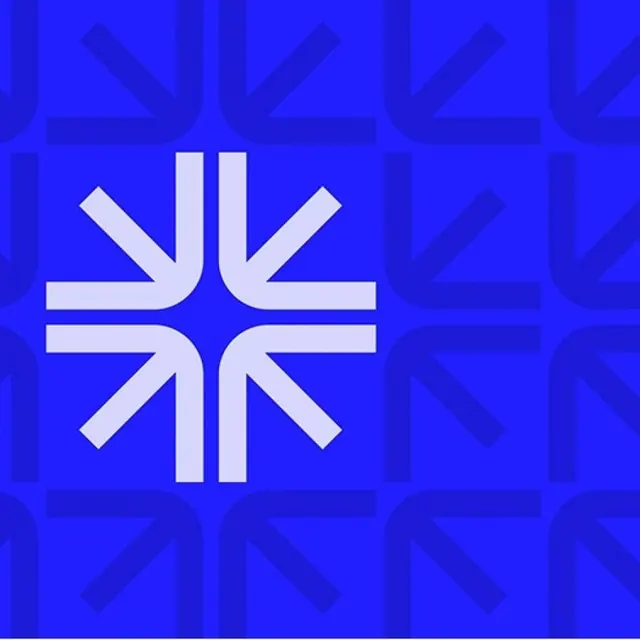
A white logomark of eight arrows converging to a center point, set on electric blue over a tonal tiled pattern built from quarter-turn rotations of the same arrow form.
Summary
A white logomark made of eight thick arrows pointing inward toward a shared center, centered on an electric-blue square. Behind it, a tonal grid tiles a single quarter of that mark, rotated, in a barely-darker blue.
Visual description
The foreground symbol is a compact starburst: pairs of arrowheads on the four diagonals plus straight shafts on the vertical and horizontal axes, all rounded-cornered and converging on an empty pin-point at center, so the eye reads inward motion and focus. It sits crisp white on a saturated cobalt-blue field. The same arrow unit, reduced to one corner cluster, repeats across the whole background as a tile, drawn one shade deeper than the ground so it reads as quiet texture rather than competing pattern. High contrast on the hero mark, near-monochrome tone-on-tone behind it.
Key takeaway
Build the brand pattern out of a fragment of the logo itself: take one quadrant of the mark, rotate and tile it, and drop its contrast to near-tonal so it backs the logo without fighting it. The converging arrows give an instant "bring together / focus" metaphor in pure geometry, no text needed.
Reuse notes
A clean kit for fintech, productivity, or any brand whose story is consolidation, convergence, or alignment. The tone-on-tone tile is the reusable trick for backgrounds, slides, and packaging. Holds up at small sizes thanks to the heavy rounded strokes, but leans heavily on that single electric blue, so define a fallback for mono and dark contexts.
More like this


Keep what you find
A free account saves references to boards and can send you a weekly email of picks based on what you save.
To see every result, go Pro.