Preview image. Unlock full-res
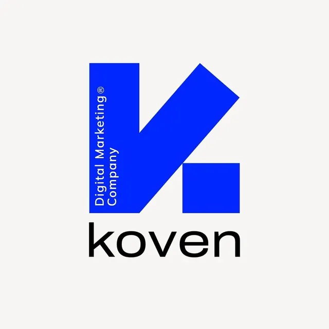
A blocky electric-blue 'K' monogram built from cut geometric shapes, with vertical agency descriptor text running up its stem and a lowercase 'koven' wordmark below.
Summary
A bold electric-blue monogram that reads as a chunky letter 'K' assembled from a vertical bar, an angled blade, and a detached square foot. The defining move is running tiny vertical descriptor type up the inside of the stem instead of placing a tagline beneath.
Visual description
The mark sits centered on a warm off-white field. It is built from three solid royal-blue shapes: a tall rectangle on the left, a thick diagonal slab crossing from upper right down to center, and a separate square block at lower right, together implying a stylized 'K'. Reversed out of the left bar, small white sans-serif text reading "Digital Marketing Company" runs bottom-to-top in two stacked lines, with a registered-trademark symbol. Below the mark, the lowercase wordmark "koven" is set large in flat black, in a clean geometric sans with generous letter spacing. Color is limited to three values: blue, near-black, and the paper background.
Key takeaway
The vertical descriptor text reversed inside the logo's stem, which integrates the tagline into the mark rather than hanging it below. Also the trick of building a letterform from disconnected geometric blocks so negative space does the reading.
Reuse notes
Strong reference for a digital agency, marketing, or tech-services identity that wants to look confident and modern on a single accent color. The disconnected-block construction needs a forgiving letterform; it works for K, H, or N better than rounded letters. Pairs well with a minimal off-white or single-color brand system.