Preview image. Unlock full-res
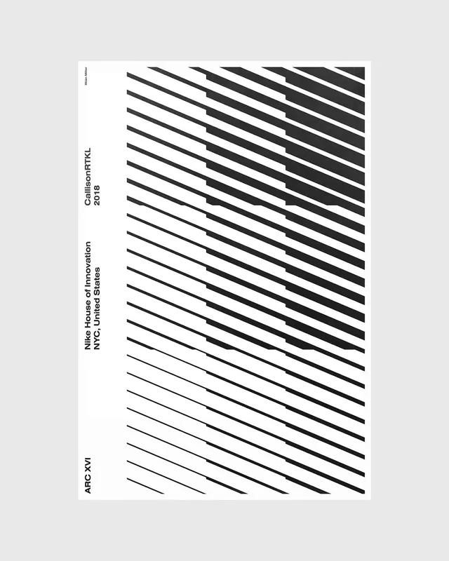
Black-and-white architecture poster building a tonal gradient from diagonal hairlines that thicken into solid black, with vertical Swiss sidebar credits.
Summary
An architecture poster that renders an entire tonal field out of diagonal hairlines: thin and sparse at the bottom-left, progressively thicker and denser toward the upper-right until they fuse into solid black bands.
Visual description
A white poster sheet floats on a light grey background. The right two-thirds is filled with parallel lines running on a shallow diagonal; their weight increases left to right and bottom to top so the lower edge reads as faint pinstripes and the top-right corner reads as near-solid black blocks, creating a stepped, almost glitched gradient. The left margin holds Swiss-style metadata set in small condensed sans-serif and rotated 90 degrees: "ARC XVI" at the foot, "Nike House of Innovation / NYC, United States" mid-column, and "CallisonRTKL / 2018" above it, with a tiny designer credit at the top. Generous untouched white separates the text column from the line field.
Key takeaway
The single mechanic of varying line weight and spacing to produce a continuous value ramp, so one repeated element does all the tonal work without any photo or fill. Pair it with rotated, baseline-aligned caption text pinned to the left margin for an instantly editorial, architectural feel.
Reuse notes
Strong template for event, exhibition, or architecture-studio posters and covers where you want texture without imagery. The rotated sidebar reads as documentation metadata, so it suits project credits, dates, and locations. Keep it strictly monochrome; color would break the optical-gradient effect.
More like this






Keep what you find
A free account saves references to boards and can send you a weekly email of picks based on what you save.
To see every result, go Pro.