Preview image. Unlock full-res
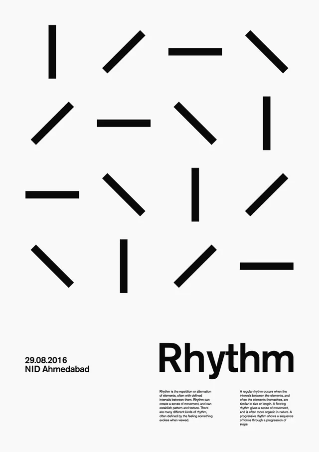
A Swiss-style design-principle poster scattering identical black dashes at varied angles across white space to demonstrate rhythm, anchored by a bold Rhythm wordmark and two columns of body text.
Summary
A portrait poster that illustrates the design principle of rhythm: roughly two dozen identical thick black dashes are scattered at horizontal, vertical and diagonal angles across the upper white field, with a heavy "Rhythm" wordmark and explanatory text grounding the bottom.
Visual description
The top two-thirds is near-empty white holding a loose, evenly distributed field of stubby black bars, all the same weight and length but rotated to different angles so the eye reads a repeating-yet-varied beat. The bottom third carries the title "Rhythm" in a large bold grotesque sans, right of center. To its left, small caps give the date and venue "29.08.2016 / NID Ahmedabad." Below the wordmark, two narrow justified columns of grey body copy define rhythm in type so small it reads as texture. Strictly black, white and grey throughout.
Key takeaway
Demonstrating the principle in the artwork itself: one repeated mark, identical in size, varied only in rotation and spacing, so the layout teaches "rhythm" without an illustration. The empty top half plus a dense type cluster at the foot is a clean Swiss tension between void and information.
Reuse notes
Ideal for a design-education series, a lecture poster set, or any one-word-concept poster where the visual should embody the word. Pairs naturally with a family of sibling posters (Balance, Contrast, Scale) using the same grid and one repeated unit each. Keep the mark count and spacing irregular enough to feel alive but ordered.
More like this



Keep what you find
A free account saves references to boards and can send you a weekly email of picks based on what you save.
To see every result, go Pro.