Preview image. Unlock full-res
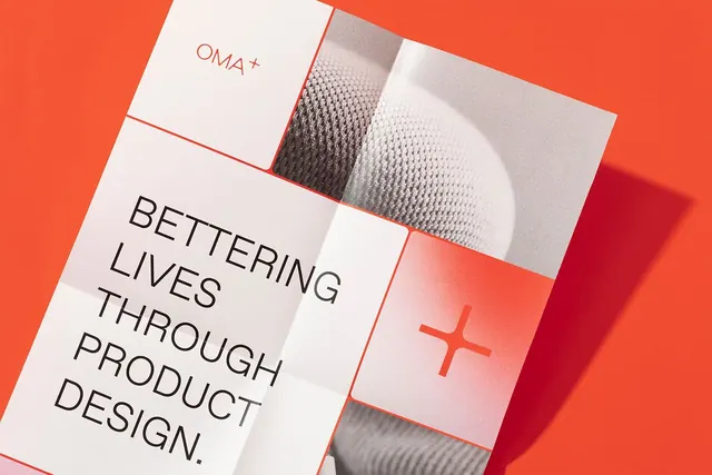
A tilted branding presentation spread with a small OMA+ wordmark, a large all-caps slogan, and cropped grayscale imagery on a vivid orange-red background.
Summary
A tilted branding presentation spread with a small OMA+ wordmark, a large all-caps slogan, and cropped grayscale imagery on a vivid orange-red background.
Visual description
A rotated white printed sheet is shown on a saturated orange-red background, with a strong shadow cast to the right. The page is divided into large rectangular panels: a small OMA+ mark at the top, a large stacked slogan in black at left, a cropped grayscale textured image at upper right, and a coral panel with a plus sign at lower right.
Key takeaway
Use a tilted, tiled print layout to make a branding system feel energetic while still staying clean and structured. A single vivid background color can make white paper, black type, and cropped imagery read very sharply.
Reuse notes
This works well for identity presentations, brand showcases, and cover visuals where you want a premium editorial feel. It is less suitable when the content needs dense explanatory copy, since the composition is already carrying most of the impact.
More like this






Keep what you find
A free account saves references to boards and can send you a weekly email of picks based on what you save.
To see every result, go Pro.