Preview image. Unlock full-res
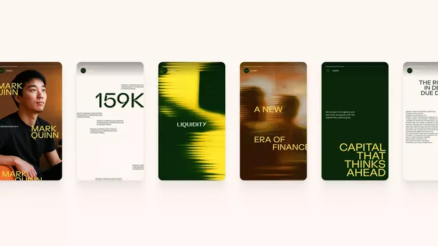
A horizontal lineup of finance-themed brand poster concepts with bold typography, muted portrait photography, and green, yellow, and brown color treatments.
Summary
A horizontal lineup of finance-themed brand poster concepts with bold typography, muted portrait photography, and green, yellow, and brown color treatments.
Visual description
A wide cream-colored canvas shows five rounded-rectangle poster designs spaced in a horizontal row. The posters use large sans-serif type, one portrait image, and several abstract green, yellow, and brown gradient or motion-blurred compositions with small white header text and the word "Liquidity" appearing on multiple cards.
Key takeaway
Use a restrained neutral backdrop to let each panel feel like a premium editorial artifact, then vary each card with a single strong visual system: portrait, statistic, abstract texture, or headline. The combination of oversized type, tiny utility text, and rounded cards creates a polished campaign grid without feeling busy.
Reuse notes
Reach for this pattern when presenting a family of brand directions, especially for finance, consulting, or tech identity work. It works best when you want each panel to feel distinct while still reading as one cohesive visual system.
More like this








Keep what you find
A free account saves references to boards and can send you a weekly email of picks based on what you save.
To see every result, go Pro.