Preview image. Unlock full-res
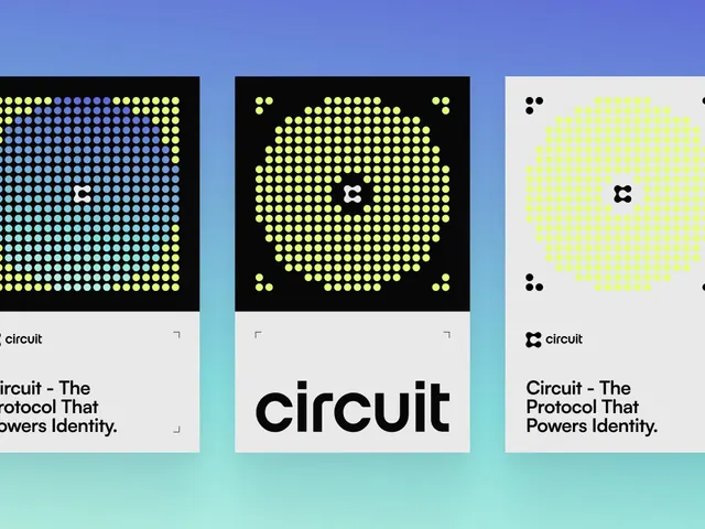
A three-panel brand identity presentation for Circuit uses dot-grid forms, neon accents, and bold typography on black and white poster compositions.
Summary
A three-panel brand identity presentation for Circuit uses dot-grid forms, neon accents, and bold typography on black and white poster compositions.
Visual description
Three tall poster-like panels sit across a blue-to-mint gradient background. Each panel combines a dense matrix of circular dots with a small logo mark, and the lower portion contains the Circuit wordmark and a bold headline on white or light gray fields.
Key takeaway
Use a strict modular dot grid to create a recognizable system that can flex across multiple compositions. Pair the structured pattern with oversized, heavy sans-serif type for a strong identity contrast.
Reuse notes
This approach works well for brand decks, launch posters, and identity systems that need a repeatable graphic language. It is especially effective for tech-forward brands that want something systematic but still visually striking.
More like this








Keep what you find
A free account saves references to boards and can send you a weekly email of picks based on what you save.
To see every result, go Pro.