Preview image. Unlock full-res
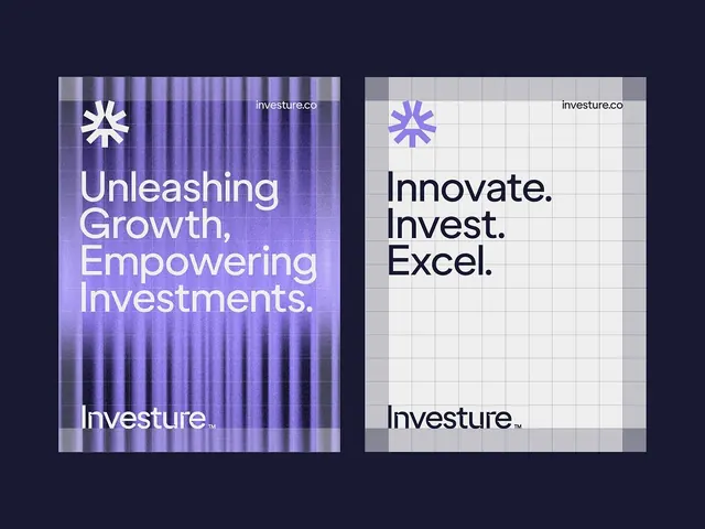
Two side-by-side brand posters for Investure use oversized typography, a star-like logo mark, and a restrained purple-and-gray identity system.
Summary
Two side-by-side brand posters for Investure use oversized typography, a star-like logo mark, and a restrained purple-and-gray identity system.
Visual description
The image shows two poster-style layouts centered on a dark navy background. The left poster has a purple textured curtain-like backdrop with large white stacked copy and a logo mark near the top, while the right poster uses a light gray grid overlay with dark headline text and the same logo treatment.
Key takeaway
Use a strict two-column comparison layout to present alternate brand directions with the same logo and spacing logic. The contrast between a moody textured version and a clean grid version makes the identity feel versatile without changing the core system.
Reuse notes
Reach for this when you need to show a brand in multiple tonalities while keeping the typography and logo placement consistent. It works best for finance, B2B, or other categories that benefit from a polished, controlled identity system.
More like this






Keep what you find
A free account saves references to boards and can send you a weekly email of picks based on what you save.
To see every result, go Pro.