Preview image. Unlock full-res
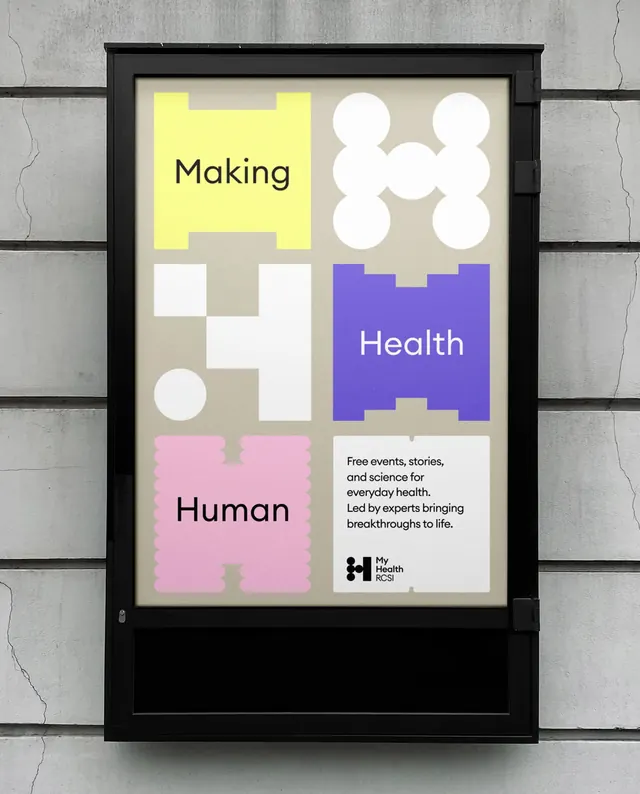
A framed identity poster uses blocky letterform shapes and simple circles to spell out a health-themed visual system.
Summary
A framed identity poster uses blocky letterform shapes and simple circles to spell out a health-themed visual system.
Visual description
A black-framed poster sits against a gray concrete wall with cracks and horizontal seams visible around it. Inside the poster, a beige background holds a 2-by-3 arrangement of large geometric blocks and circles in yellow, white, purple, and pink, with the words "Making," "Health," and "Human" placed in three of the blocks plus a small white text panel at bottom right.
Key takeaway
Use oversized modular shapes as both letterforms and containers, so the identity system feels playful but structured. Pair one bold color block per panel with a neutral ground to keep the composition readable.
Reuse notes
This approach works well for healthcare, cultural, and editorial branding that needs to feel approachable without losing order. It is strongest when the mark system can be broken into repeatable geometric units and displayed in print or poster form.
More like this





Keep what you find
A free account saves references to boards and can send you a weekly email of picks based on what you save.
To see every result, go Pro.