Preview image. Unlock full-res
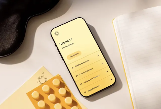
Health coaching app UI (session-based interface) paired with orange supplement packaging and pill bottles on a warm, neutral background.
Summary
A wellness app interface and supplement product ecosystem displayed together in a flat-lay, using cream and warm-yellow tones to balance clinical and approachable health coaching messaging.
Visual description
A minimalist flat-lay composition on a warm beige background. Center frame is a smartphone showing a "Session 1" coaching screen with numbered nav items ("01 Baseline Assessment", "02 Prepare for Session 1", "03 Instructions for Session 1", "04 Integrate Session 1") in yellow-on-cream buttons. To the left, an orange/golden packaging box labeled "M" holds a visible grid of pale yellow pills or capsules. A black curved object (possibly a device or container) sits in the upper left. The overall color palette moves warm and the spacing is generous and organized, suggesting structured health guidance.
Key takeaway
The warm-neutral color blocking that makes clinical health content feel approachable, the session-based sequential UI that scaffolds user progression, and the seamless integration of digital and physical product in a single branded ecosystem shot.
Reuse notes
Ideal for health tech, coaching, or supplement brands that want to position clinical efficacy without sterility. The flat-lay and warm palette work particularly well for consumer wellness, fitness, and nutrition. The numbered session framing is reusable for any step-based onboarding or program experience.
More like this

Keep what you find
A free account saves references to boards and can send you a weekly email of picks based on what you save.
To see every result, go Pro.