Preview image. Unlock full-res
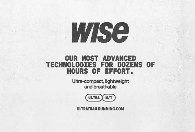
A monochrome typographic composition centers the word “wise” above stacked promotional copy and two pill-shaped labels on a paper-textured background.
Summary
A monochrome typographic composition centers the word “wise” above stacked promotional copy and two pill-shaped labels on a paper-textured background.
Visual description
The image shows a centered black wordmark reading “wise” on an off-white, heavily textured background. Below it are three stacked lines of bold all-caps copy, a smaller two-line subheading, two outlined pill badges, and a website line at the bottom.
Key takeaway
Use a single oversized wordmark with compact stacked messaging beneath it to create a strong hierarchy. The rough, stamped typography against a paper texture gives the layout an analog, printed feel without adding illustration.
Reuse notes
This works well for brand promos, event posters, or campaign graphics that need a stark, editorial presentation. It is especially effective when you want minimal structure but still need the design to feel tactile and memorable.
More like this





Keep what you find
A free account saves references to boards and can send you a weekly email of picks based on what you save.
To see every result, go Pro.