Preview image. Unlock full-res
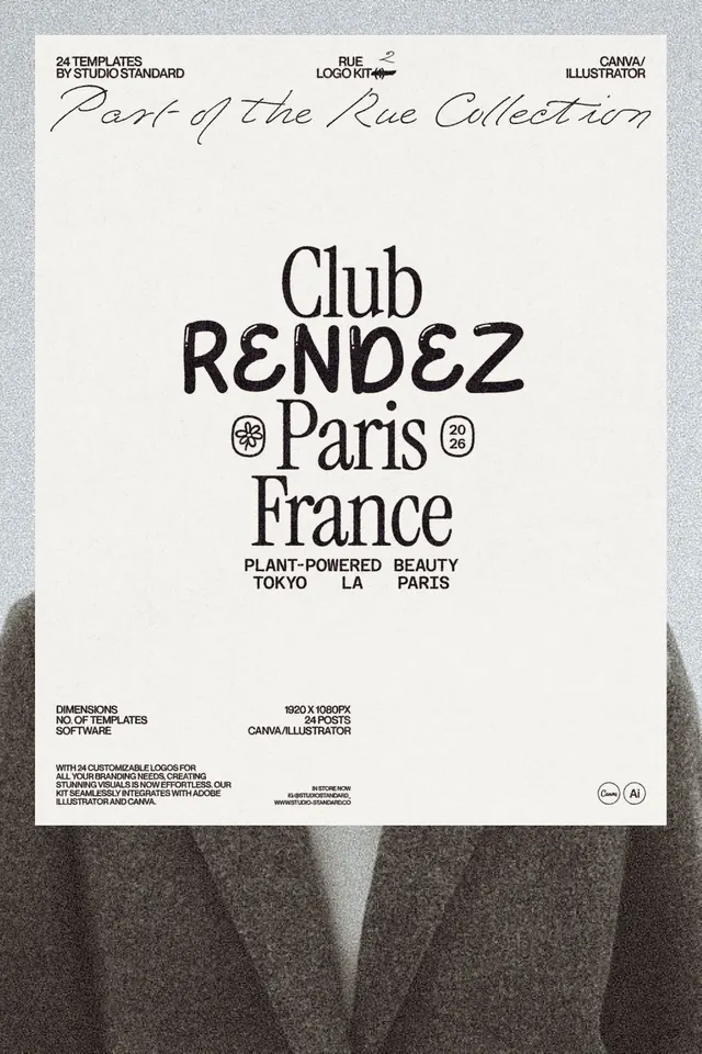
A monochrome promotional poster for a logo kit featuring a centered typographic lockup with layered serif and handwritten lettering.
Summary
A monochrome promotional poster for a logo kit featuring a centered typographic lockup with layered serif and handwritten lettering.
Visual description
The image shows a photographed poster on a textured gray background with a large white sheet centered in frame. At the top are small labels and a handwritten script line, and the middle is dominated by a stacked typographic composition reading Club, RENDEZ, Paris, France with small decorative marks and side badges.
Key takeaway
Use strong typographic hierarchy with one oversized central word and supporting lines above and below it. Mixing serif, display, and handwritten styles gives the layout a premium, editorial feel without needing imagery.
Reuse notes
This approach works well for identity presentations, logo kits, and boutique-brand promotional posters. It is especially effective when you want a clean, print-like composition that feels tactile and slightly fashion-forward.
More like this





Keep what you find
A free account saves references to boards and can send you a weekly email of picks based on what you save.
To see every result, go Pro.