Preview image. Unlock full-res
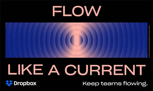
A black Dropbox campaign banner with a concentric blue-to-peach ripple panel framed by oversized pink headline type reading FLOW LIKE A CURRENT.
Summary
A horizontal Dropbox campaign banner on solid black: a central rectangular panel of concentric rings rippling from deep blue at the edges to a soft peach core, sandwiched between the word FLOW on top and LIKE A CURRENT below in large pink caps.
Visual description
The layout is symmetric and horizontal. A wide gradient panel runs edge to edge across the middle, its bullseye of concentric circles shifting hue from indigo through violet to a luminous peach center, evoking a sonar pulse or water ripple. Salmon-pink display type frames it: a single big word above, a full-width line below. The lower-left carries the Dropbox logo and wordmark in pink, balanced lower-right by the tagline "Keep teams flowing." A tiny vertical artwork credit runs up the right edge.
Key takeaway
The literal ripple gradient as the entire visual, no product shot needed, just a concentric blue-to-warm bullseye that animates the word "flow" graphically. The salmon-on-black type-sandwich format, where the headline splits above and below the image panel, scales cleanly to any banner ratio.
Reuse notes
Good for a SaaS or productivity campaign that wants an abstract, motion-implying key visual instead of a UI screenshot. Pairs a warm pink with a cool gradient for contrast against black. Caveat: the bullseye reads as audio or radar to some viewers, lean on the copy to fix the "flow" meaning.
More like this




Keep what you find
A free account saves references to boards and can send you a weekly email of picks based on what you save.
To see every result, go Pro.