Preview image. Unlock full-res
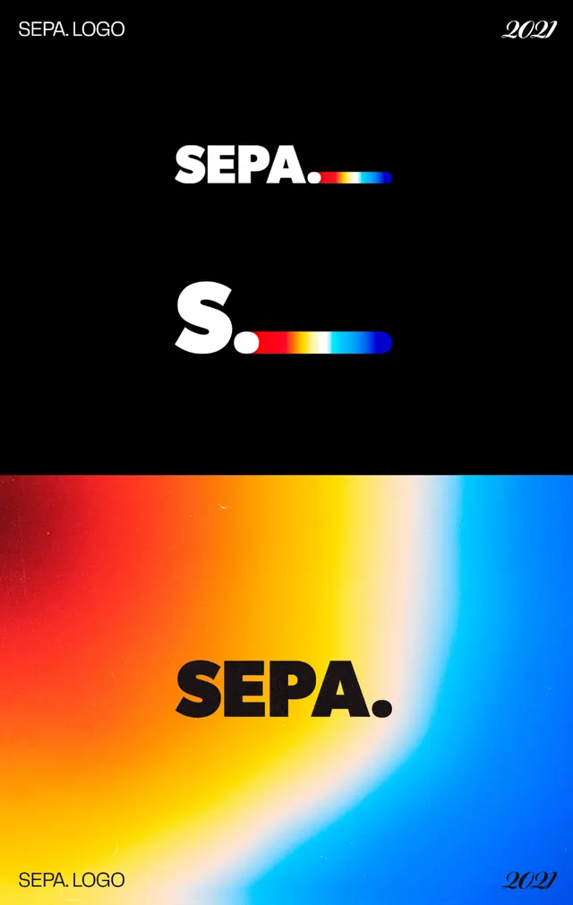
A logo presentation for SEPA pairing a bold sans wordmark and trailing period with a horizontal blue-yellow-red gradient bar, shown over black and over a fiery gradient field.
Summary
A logo case study for a brand called SEPA, where the wordmark is always followed by a period and a short horizontal color bar that ramps blue to yellow to red. The board shows the full lockup, an "S." monogram, and the mark reused large over a gradient.
Visual description
The image is split into a black upper panel and a gradient lower panel. On black, white "SEPA." sits beside a thin gradient bar, and below it a condensed "S." monogram repeats the same bar treatment, demonstrating the short and long forms. The corners carry small "SEPA. LOGO" and "2021" caption labels in a grid-system style. The lower panel is a soft, blurred gradient field blooming from cool blue at the edges into orange and red at center, with a large black "SEPA." wordmark placed bottom-left for an in-context application shot. The type is a heavy geometric sans; the gradient bar is the one recurring brand device.
Key takeaway
The trailing period plus a tiny gradient bar gives a plain sans wordmark a memorable, ownable signature that scales down to a single-letter monogram. Presenting the mark twice (logo on black, logo on its own gradient world) is a clean way to prove a system rather than a one-off.
Reuse notes
Works for fintech, payments, or any brand wanting an energetic accent on otherwise neutral typography. The gradient ramp doubles as a flexible background; keep the wordmark heavy and the bar thin so the color reads as an accent, not the headline. Pair the black and gradient panels when you need to show both light and expressive surfaces.