Preview image. Unlock full-res
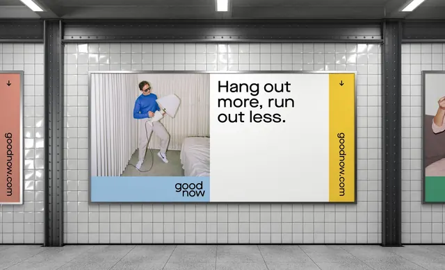
A subway-platform OOH billboard mockup for goodnow pairing the slogan 'Hang out more, run out less.' with a studio lifestyle photo and pastel color-block panels.
Summary
A presentation mockup placing a goodnow brand poster on a tiled subway-station wall. The poster splits into a studio lifestyle photo on the left and a clean white text panel carrying the slogan "Hang out more, run out less." on the right.
Visual description
The scene is a grey-tiled subway platform with the brand campaign mounted as a wide horizontal lightbox. Inside, a soft-pastel system divides the artwork: a person in a blue top is photographed against a neutral studio set, framed by a pale-blue band at the bottom; to its right, a white panel holds the black sans-serif slogan set in two short lines. The stacked "good / now" wordmark sits small at the lower edge of the photo. Flanking yellow vertical tabs run the URL "goodnow.com" in rotated type, reading like the edge of a magazine or app card, and partial neighboring posters are visible at left and right to sell the in-context placement. The palette stays muted (greys, off-white, soft blue) with the yellow tabs as the single warm accent.
Key takeaway
The split of one panel into framed lifestyle photo plus a clean type panel is a flexible campaign template that flexes across formats. The rotated URL tabs on colored vertical bands turn the simple website address into a recognizable brand device. Presenting the artwork inside a realistic subway mockup instantly communicates scale and tone to a client far better than a flat artboard.
Reuse notes
Use this when pitching an OOH or transit campaign and you want stakeholders to feel the placement, not just the layout. The muted-pastel-plus-one-accent palette and short conversational slogan suit wellness, lifestyle, and consumer brands. The vertical URL tab is the reusable idea; keep the photography on a consistent neutral set so multiple executions stay in family.
More like this






Keep what you find
A free account saves references to boards and can send you a weekly email of picks based on what you save.
To see every result, go Pro.