Preview image. Unlock full-res
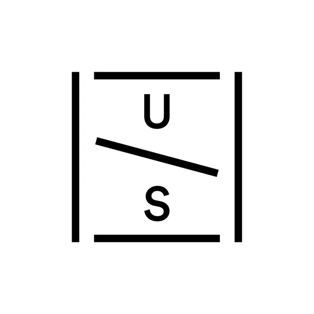
A strict black-on-white monogram logo builds a square frame from four line segments, places a diagonal rule across its center, and positions the uppercase letters U and S above and below the slash.
Summary
A monogram logo for initials U/S constructs its container from four separate line segments that form an open-cornered square frame, then uses a bold diagonal slash to divide the letterforms into a fraction-like arrangement.
Visual description
White square canvas. The logo consists of four thick black line segments arranged to suggest a square bracket enclosure: two short horizontal bars at top and bottom, and two vertical bars at left and right, with the corners left open (not touching). Inside this open-corner square, an uppercase "U" sits in the upper half and an uppercase "S" in the lower half, both in a geometric display sans-serif with moderate stroke weight. Between them, a bold diagonal line runs from lower-left to upper-right, wider and heavier than the border segments, acting as a visible divider or slash. The entire mark is centered on a plain white ground with generous margin on all sides. No wordmark, no color, no secondary typography.
Key takeaway
The open-corner square frame: using four separate segments instead of a closed rectangle lets the enclosure feel architectural and confident without boxing the mark in. The diagonal slash as a typographic separator (the fraction device borrowed from fractions and ratios) gives a two-initial monogram immediate visual interest and a dynamic axis. The line weights are deliberately varied, heavy slash, lighter border, medium letterforms, creating hierarchy within a single-color mark.
Reuse notes
Directly applicable to any two-initial brand identity that wants a construction-forward, system-thinking feel. The open corner frame reads well at small sizes because the letters carry the mark when the frame lines compress. The fraction/slash device works especially well for studio partnerships, co-brands, or product lines with a clear A/B distinction.