Preview image. Unlock full-res
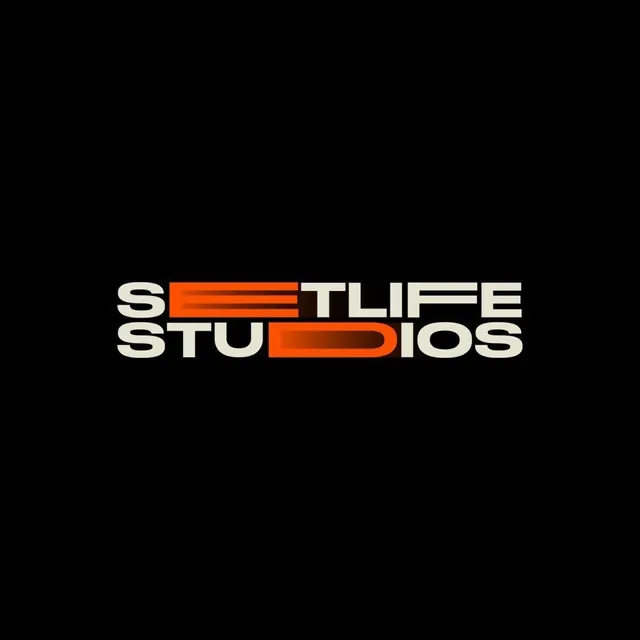
A two-line wordmark for Setlife Studios where select letters stretch into orange motion streaks against black, fusing condensed type with a sense of speed.
Summary
A stacked two-line logotype reading SETLIFE STUDIOS in heavy condensed caps on black, where the E of SETLIFE and the D of STUDIOS are elongated horizontally into orange streaks. The defining device is turning specific letters into speed lines.
Visual description
Two lines of bold, slightly italicized condensed sans-serif sit centered on a solid black field. Most letters are a warm off-white cream. Two letters break the rule: in the top line the E is stretched into a long horizontal bar that trails into bright orange, and in the bottom line the D is similarly extruded into a rounded orange capsule. The orange runs from a deep red core to a hotter orange at the trailing edge, reading as a gradient streak or motion blur. The blur direction is leftward, as if the wordmark is moving fast to the right. Tight letter spacing and the stacked arrangement keep the two words locked into a single dense block.
Key takeaway
Extending just one or two letters into horizontal motion streaks injects speed and energy into an otherwise static, blocky logotype without redrawing the whole face. Coloring only those stretched letters orange against a cream-on-black wordmark makes the speed gesture the focal point and doubles as the brand accent.
Reuse notes
Built for a film, production or sports media studio that wants a fast, confident, slightly retro-athletic feel. Works best on black where the orange streak can glow. Pairs with cinematic photography and motion. Caveat: the letter-stretch trick depends on words containing a letter that reads well elongated; not every name will accommodate it.
More like this


Keep what you find
A free account saves references to boards and can send you a weekly email of picks based on what you save.
To see every result, go Pro.