Preview image. Unlock full-res
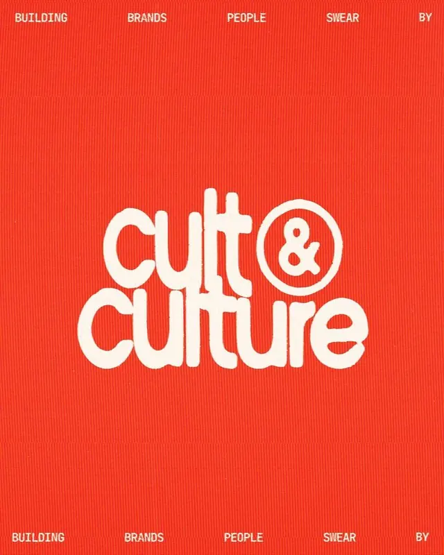
A chunky cream rounded-sans wordmark reading cult and culture sits centered on a saturated red-orange field, framed by a repeating thin-caps tagline running along the top and bottom edges.
Summary
A logotype study where a heavy, rounded cream wordmark reading "cult & culture" anchors a flat red-orange poster, with the brand promise repeated as small caps along the top and bottom edges.
Visual description
The wordmark stacks on two lines, "cult &" above "culture", set in a bouncy rounded geometric sans with very tight letter spacing and soft terminals. The ampersand is enclosed in its own thin circle, breaking the otherwise solid letterforms. Type and circle are an off-white cream that reads as a single contiguous shape against the warm red-orange ground. Running edge to edge across the top, and mirrored across the bottom, is the line "BUILDING BRANDS PEOPLE SWEAR BY" in small, widely tracked uppercase, the words spaced apart so they span the full width. The composition is strictly centered with generous empty field above and below the mark.
Key takeaway
The contrast of scales: one oversized soft wordmark doing all the visual work, bracketed by a hairline all-caps tagline that frames the canvas like a ruled border. Enclosing just the ampersand in a circle adds a focal accent without disturbing the rounded rhythm of the rest.
Reuse notes
A strong template for a culture-forward agency or studio identity, a launch poster, or a cover slide. The single-hue flat ground keeps it cheap to reproduce on merch and signage. Needs a genuinely characterful rounded display face to carry it; on a generic geometric sans the warmth disappears.