Preview image. Unlock full-res
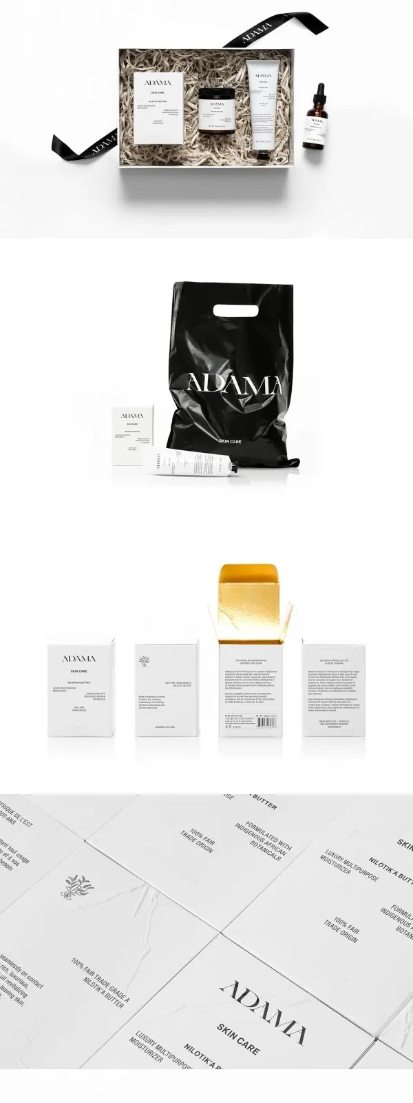
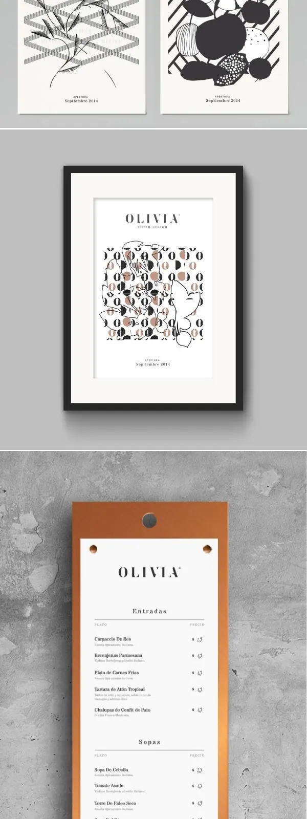
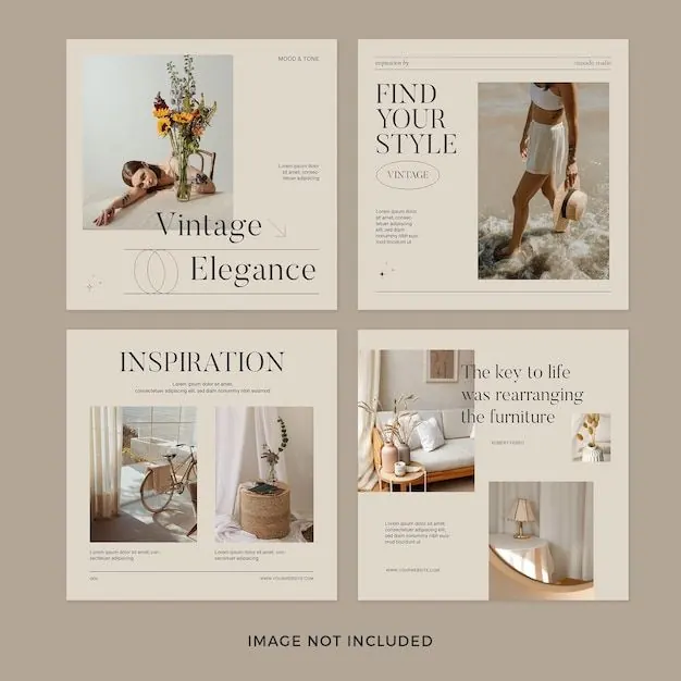
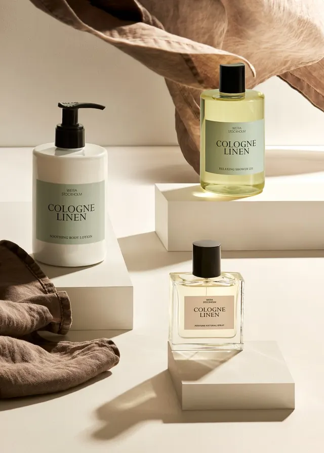
A minimalist branding layout with a large serif wordmark, three framed product-style photographs, and small footer text on a textured light background.
Summary
A minimalist branding layout with a large serif wordmark, three framed product-style photographs, and small footer text on a textured light background.
Visual description
The image shows a centered brand composition on a warm off-white textured background. A large serif title sits above the word POTTERY, followed by three tall photo panels in pale borders and a small footer area with date and collaboration text. The overall arrangement is airy, restrained, and editorial.
Key takeaway
Use a strong centered wordmark with lots of negative space, then anchor it with a clean row of framed imagery. The thin borders, muted palette, and small footer details make the layout feel refined without adding complexity.
Reuse notes
This works well for brand launches, lookbooks, and campaign covers where the goal is to feel premium and understated. It is especially effective when the visuals are mostly photography and the type needs room to breathe.